PROCESS
ZODIACKS is a collectible snack series inspired by the twelve animals of the Chinese zodiac. Each mini candy pack features unique, character-driven packaging that reflects the personality of its zodiac animal. Designed with bold colors, charming facial expressions, and signature ear shapes or horns, the packaging itself becomes part of the collectible experience.
ZODIACKS – A Snack For Every Sign
# FFD4EA
C (0) M (18) Y (7) K (0)
# FFD4EA
C (0) M (18) Y (7) K (0)
Deliverables
Logo Concept
Packaging Display
Tools
Illustrator
Photoshop
About ZODIACKS
The name “ZODIACKS” combines zodiac and snacks — capturing the spirit of cultural tradition with a modern, playful twist.Designed for gifting, trading, or enjoying on the go, ZODIACKS turns snacking into a joyful ritual that celebrates identity, nostalgia, and luck in bite-sized form.
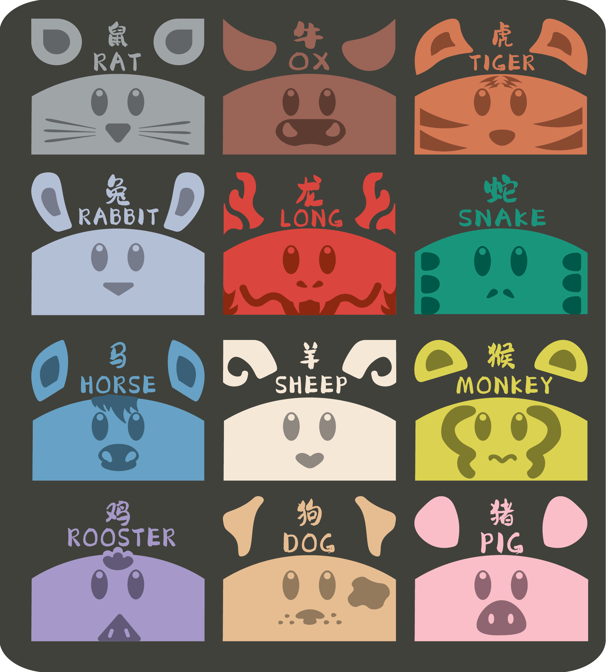
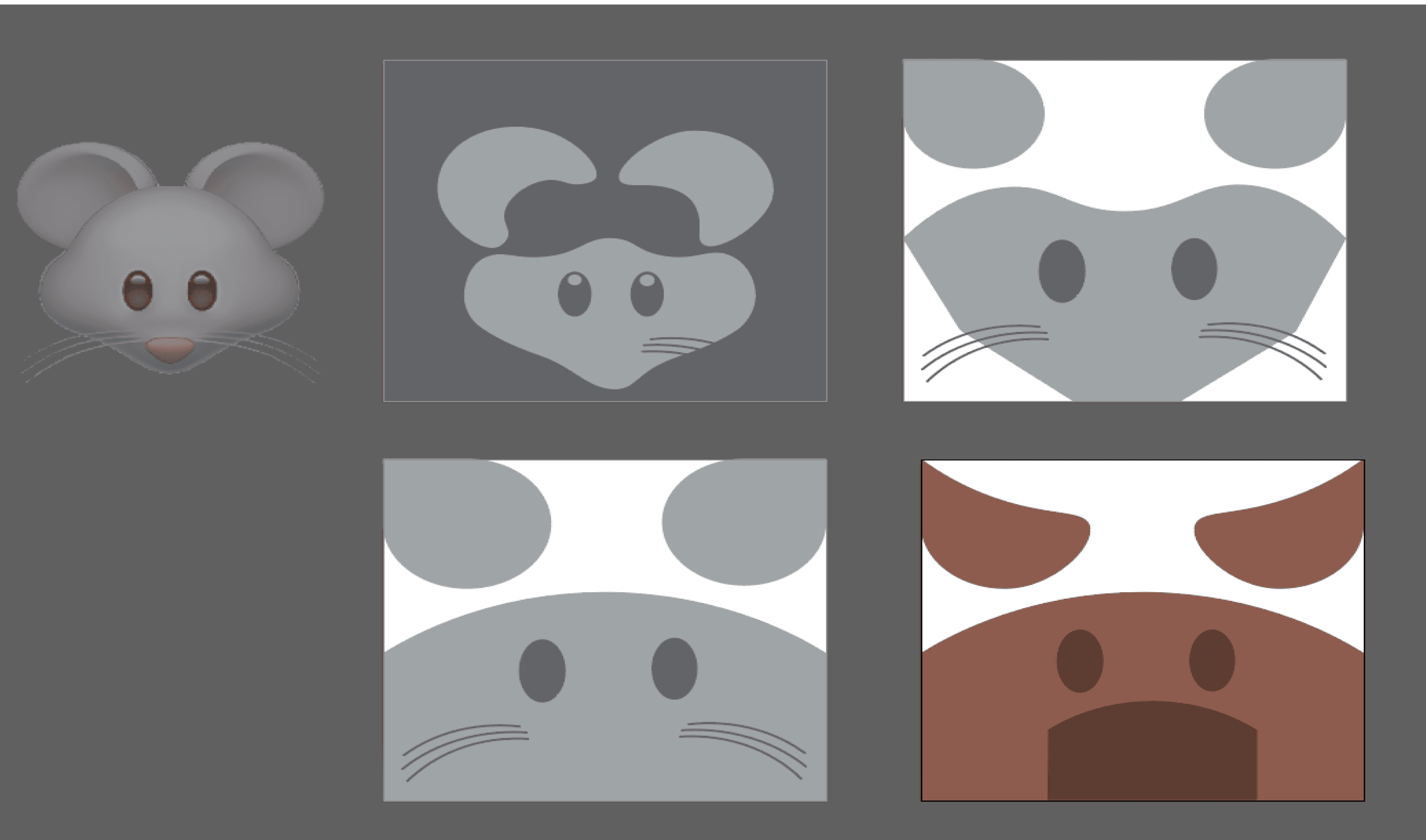
From Emoji to Icon
The design process for ZODIACKS began with a simple idea: reimagining each Chinese zodiac animal starting from familiar, friendly emoji forms. These expressive bases provided a playful foundation for exploring identity and emotion. From there, I translated each animal into a minimal, flat style using a mix of geometric and organic shapes. The goal was to strip each face down to its most essential features—ears, eyes, noses, and markings—while keeping the expressions simple, cute, and immediately recognizable.
BRAND FONT
ZODIACKS
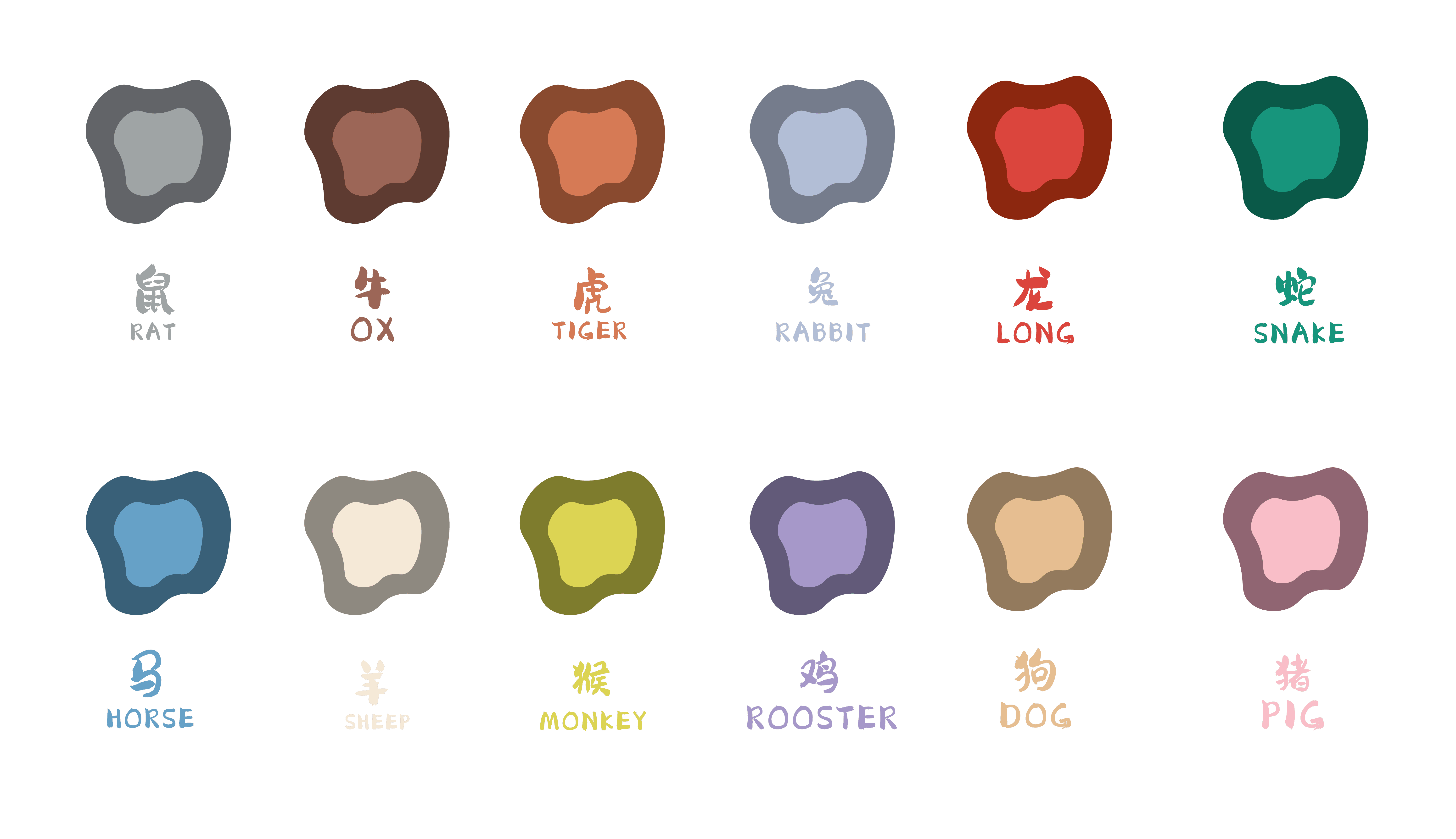
RAT
OX
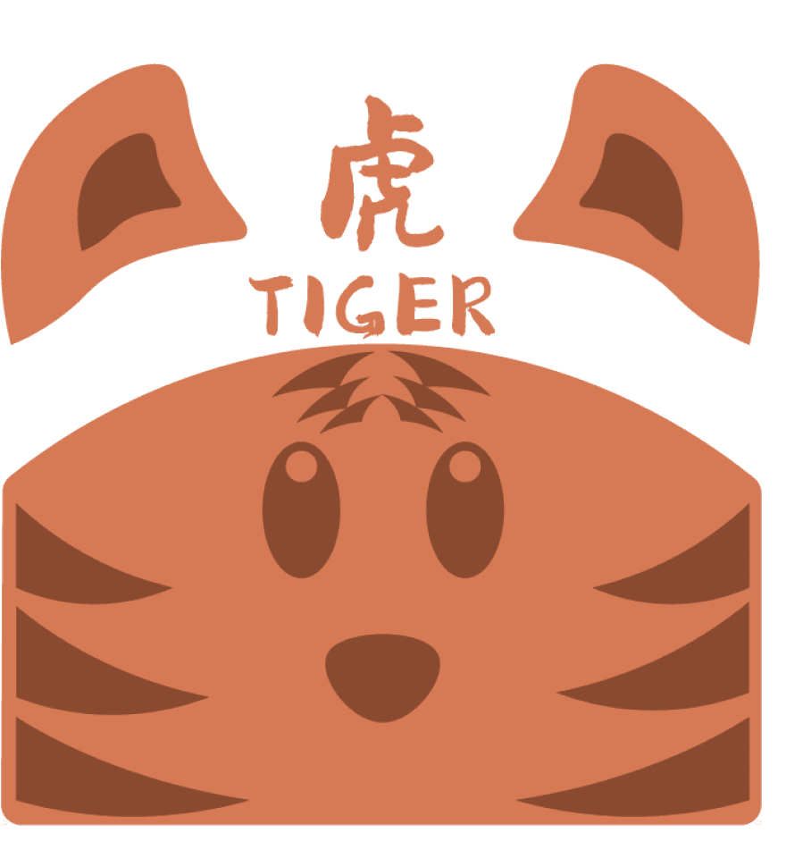
TIGER
RABBIT
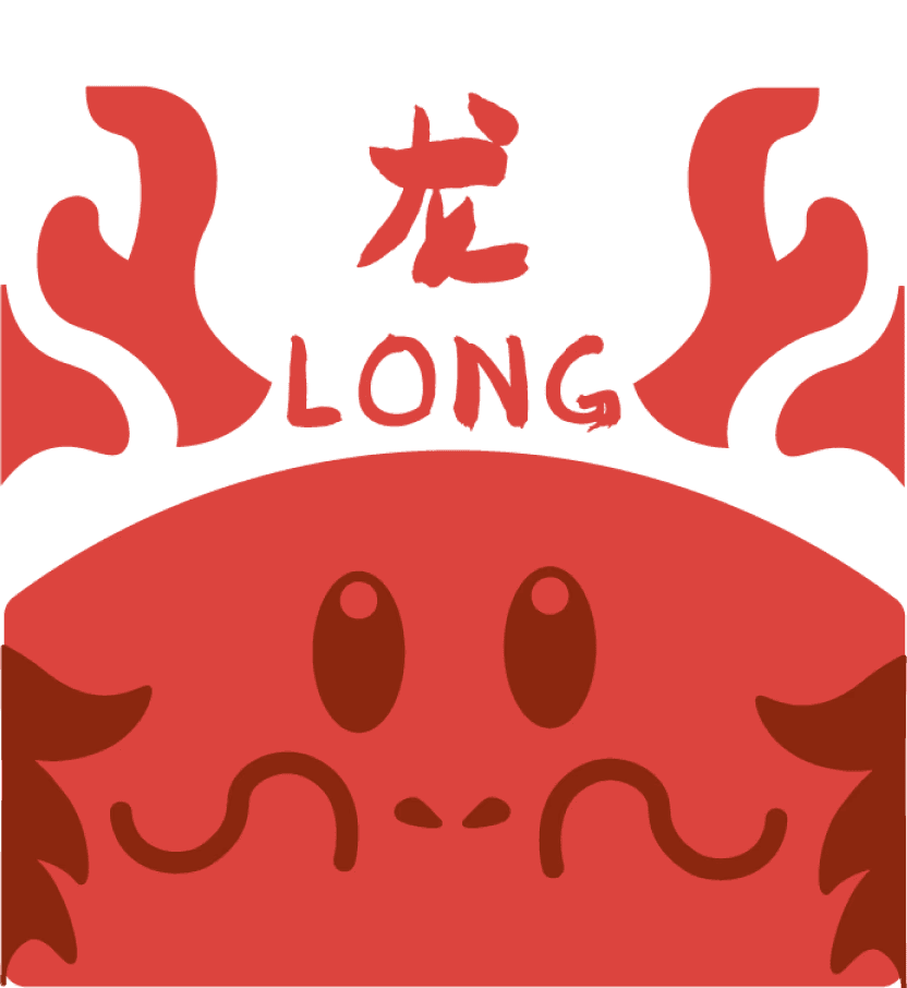
LONG
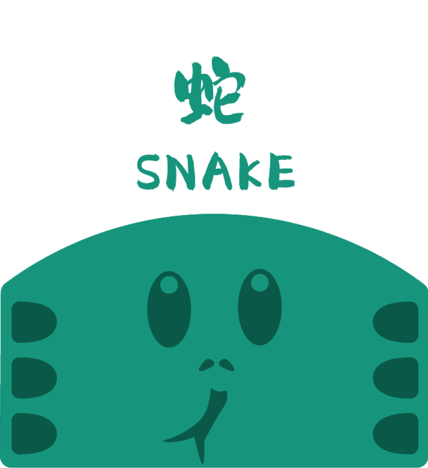
SNAKE
HORSE
SHEEP
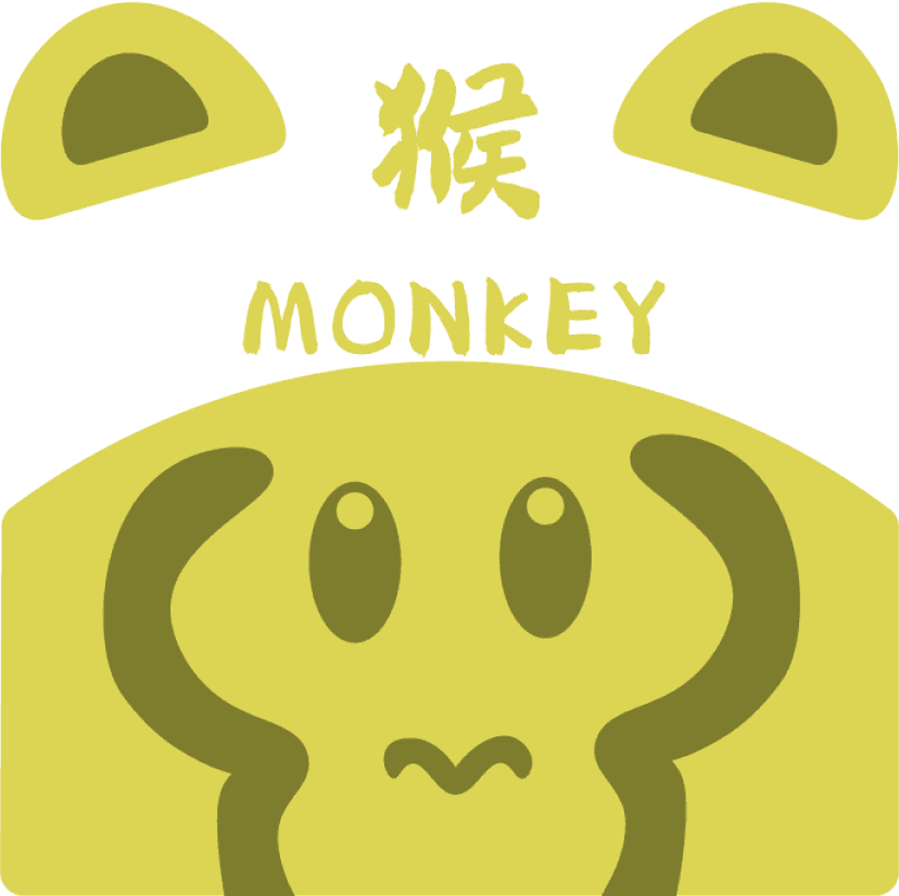
MONKEY
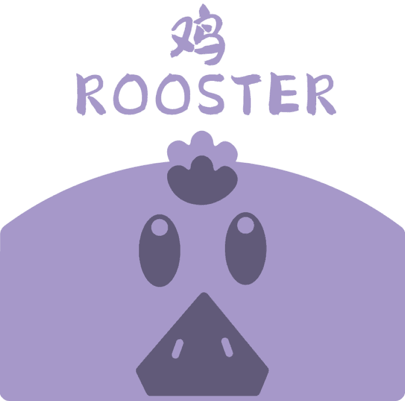
ROOSTER
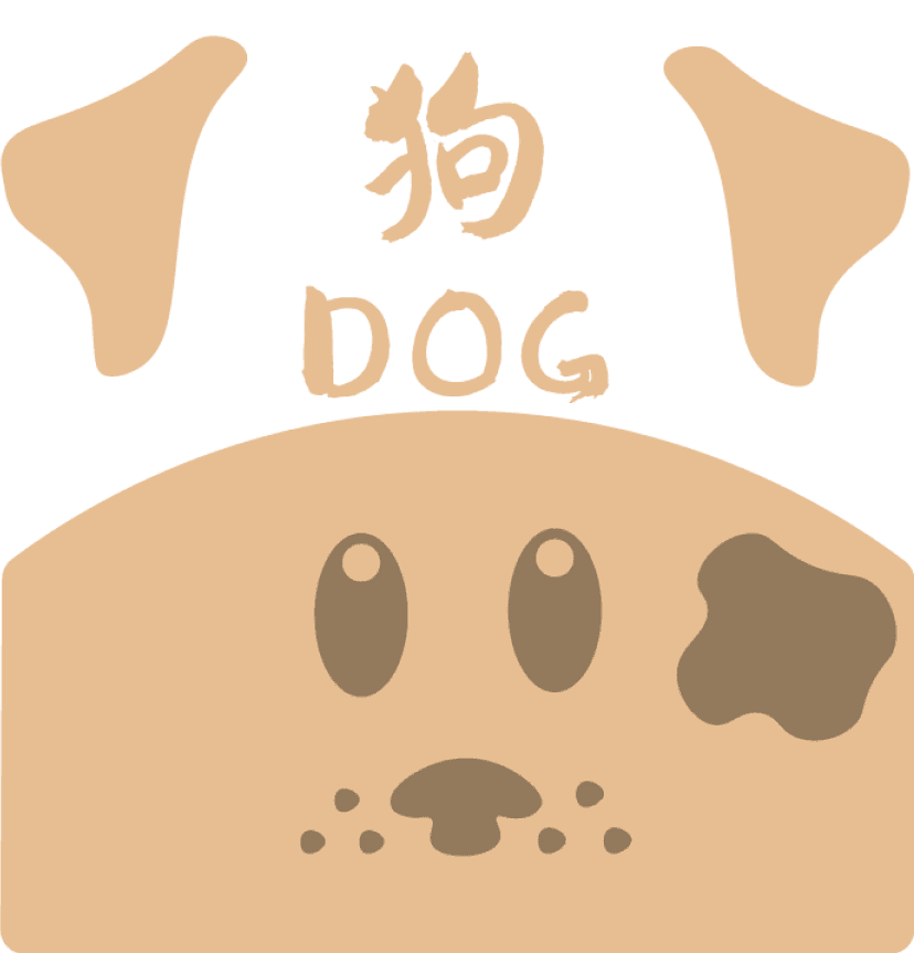
DOG
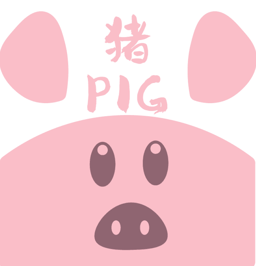
PIG
ZODIACKS
RAT
OX
TIGER
RABBIT
LONG
SNAKE
HORSE
SHEEP
MONKEY
ROOSTER
DOG
PIG
ZODIACKS
RAT
OX
TIGER
RABBIT
LONG
SNAKE
HORSE
SHEEP
MONKEY
ROOSTER
DOG
PIG
ZODIACKS
RAT
OX
TIGER
RABBIT
LONG
SNAKE
HORSE
SHEEP
MONKEY
ROOSTER
DOG
PIG
ZODIACKS
RAT
OX
TIGER
RABBIT
LONG
SNAKE
HORSE
SHEEP
MONKEY
ROOSTER
DOG
PIG
ZODIACKS
RAT
OX
TIGER
RABBIT
LONG
SNAKE
HORSE
SHEEP
MONKEY
ROOSTER
DOG
PIG
TYPEFACE: gongfanmianfeiti2.0
COLOUR PALETTE
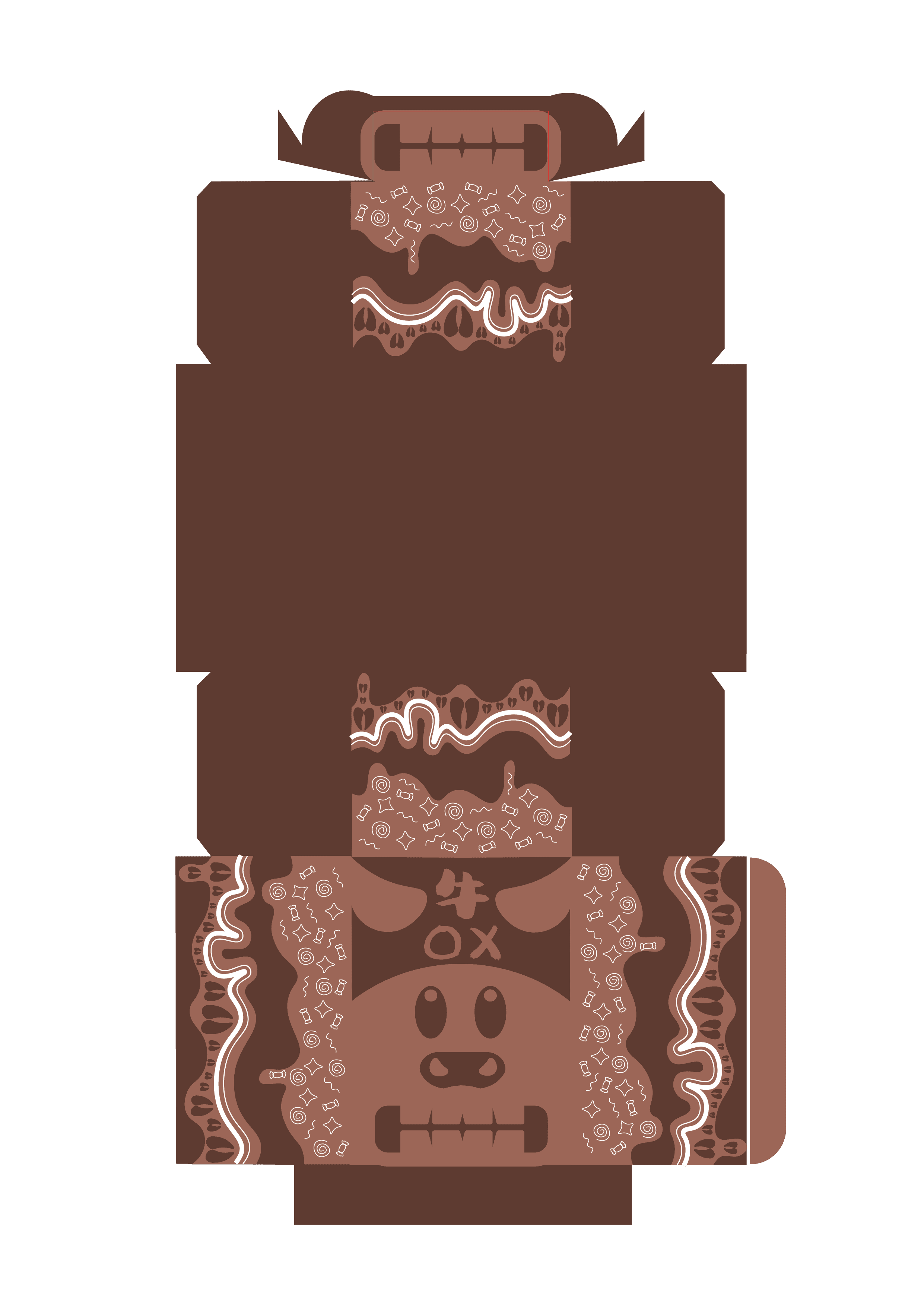
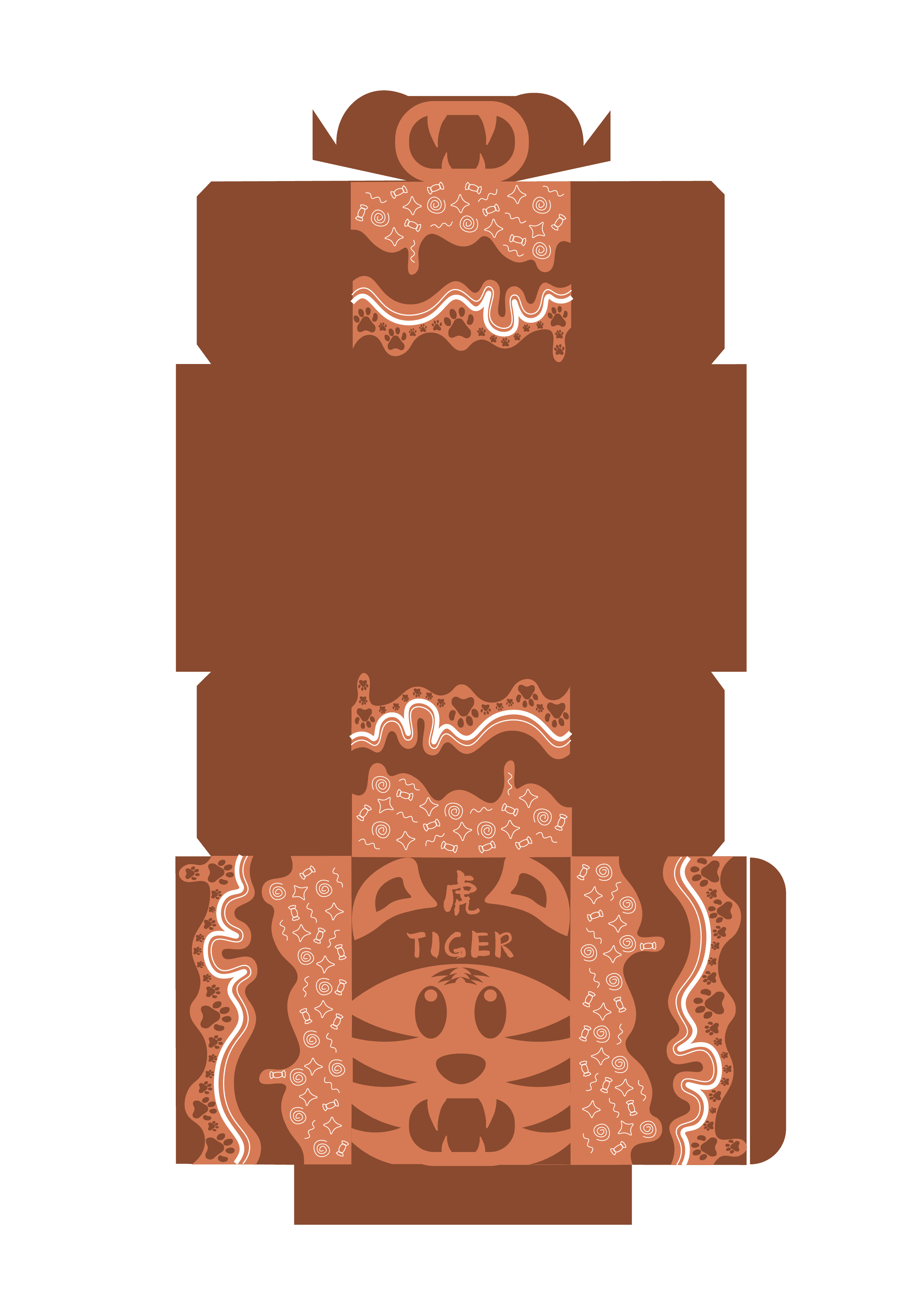
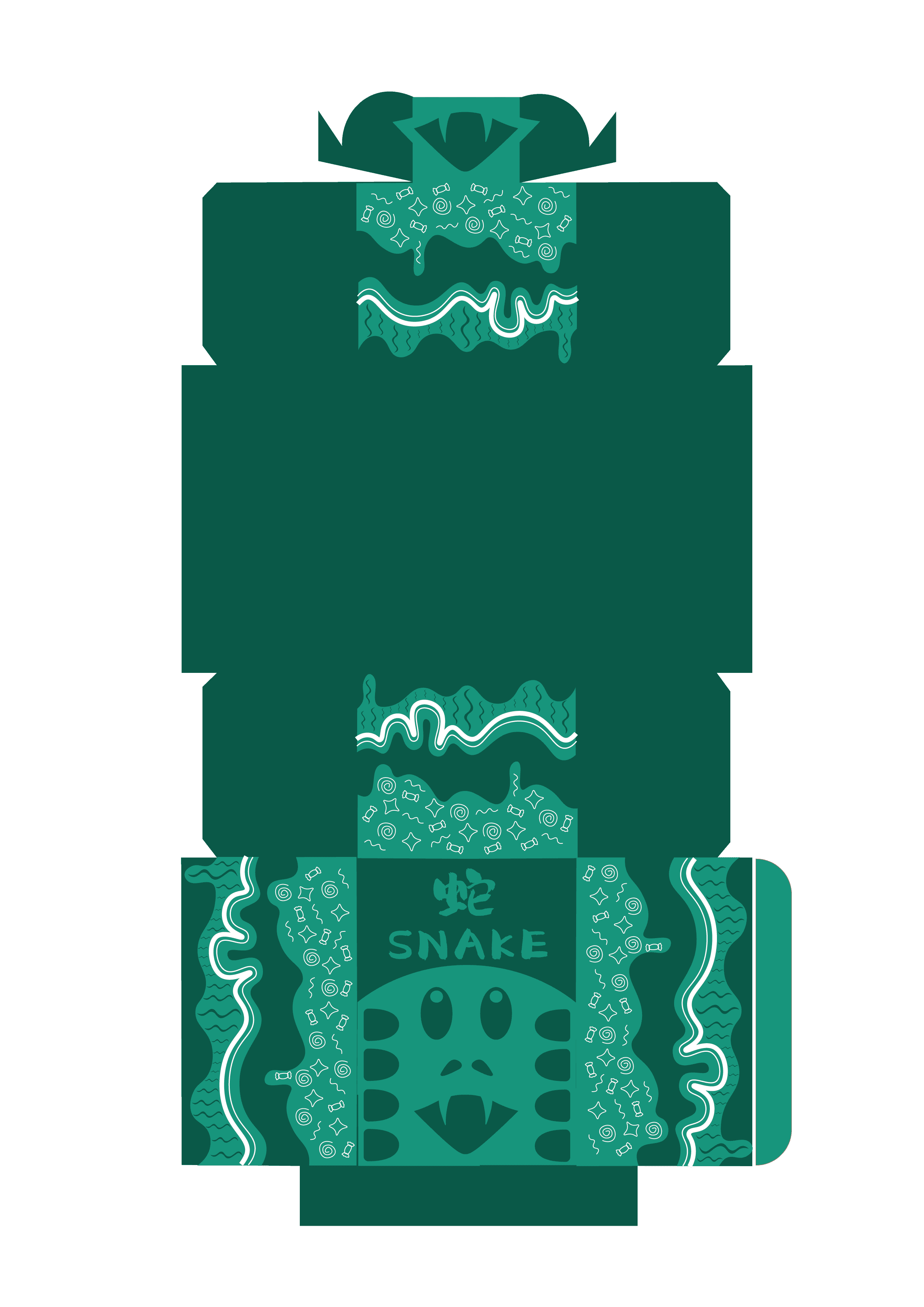
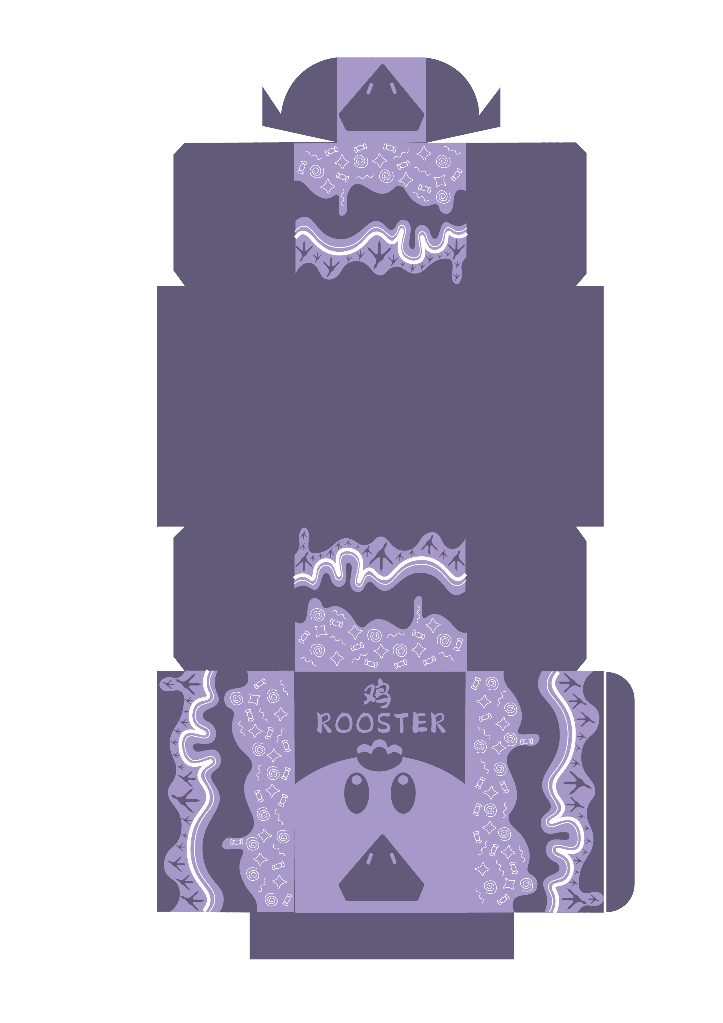
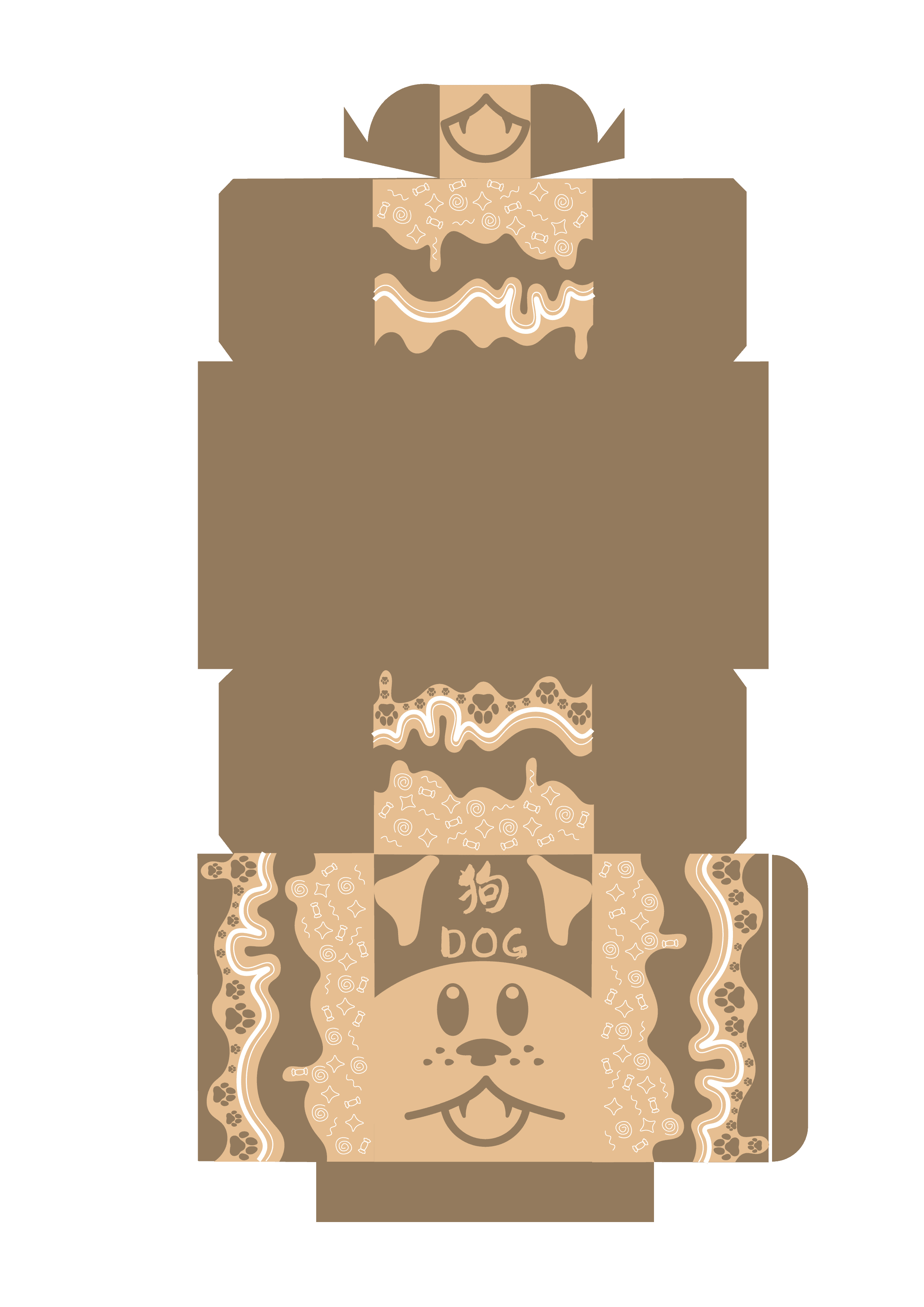
DIE CUT DESIGN - VERSION 1


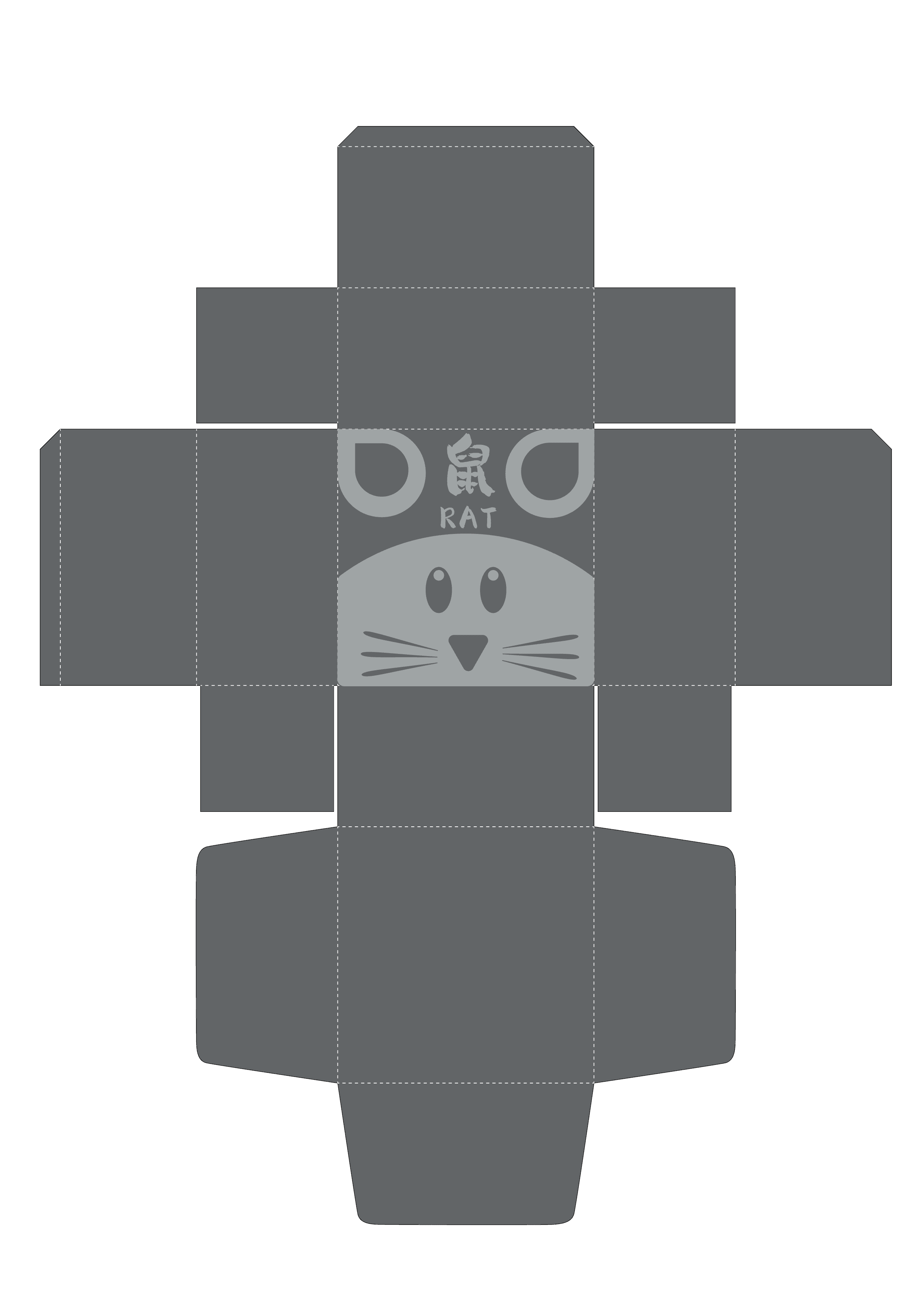

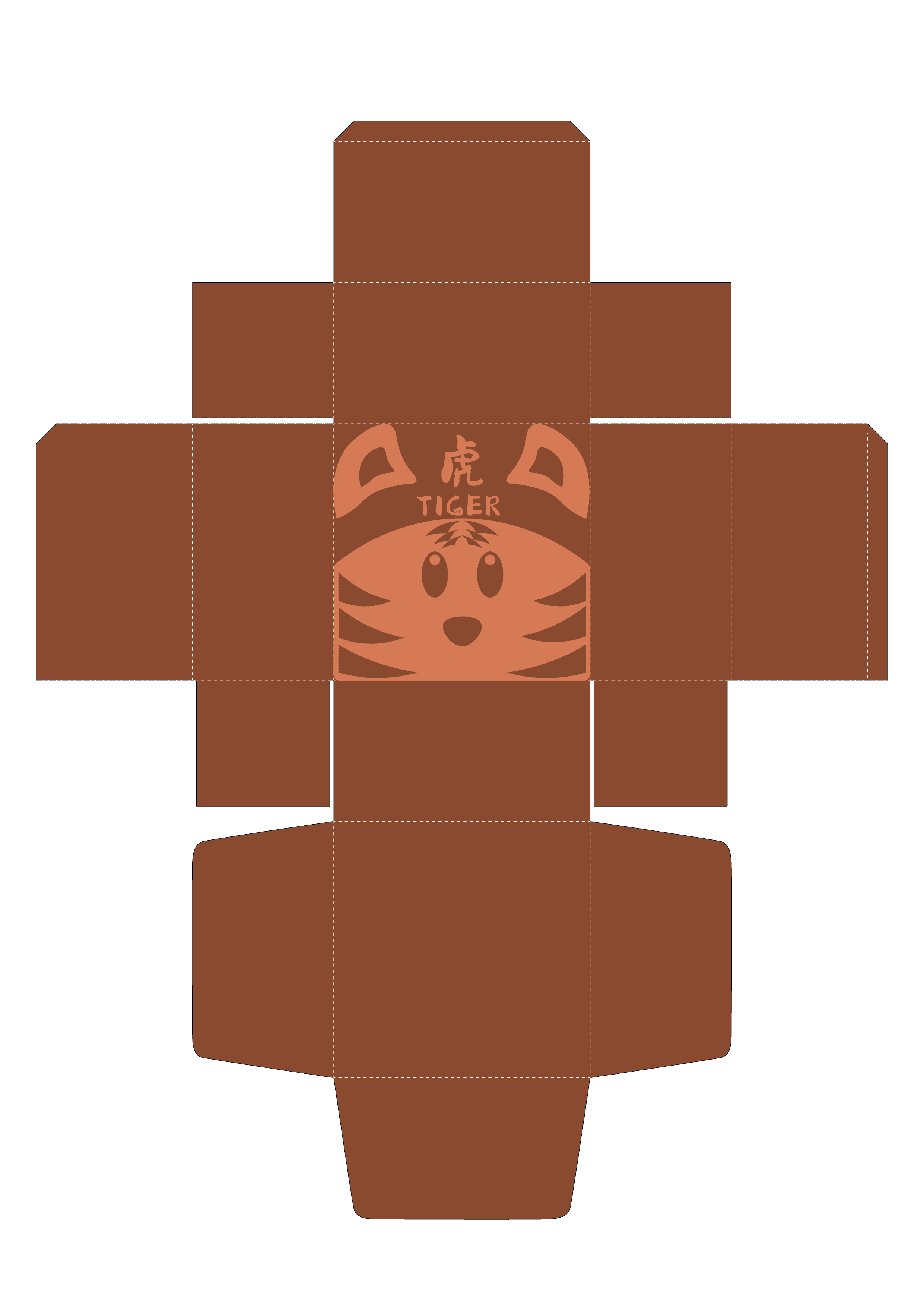
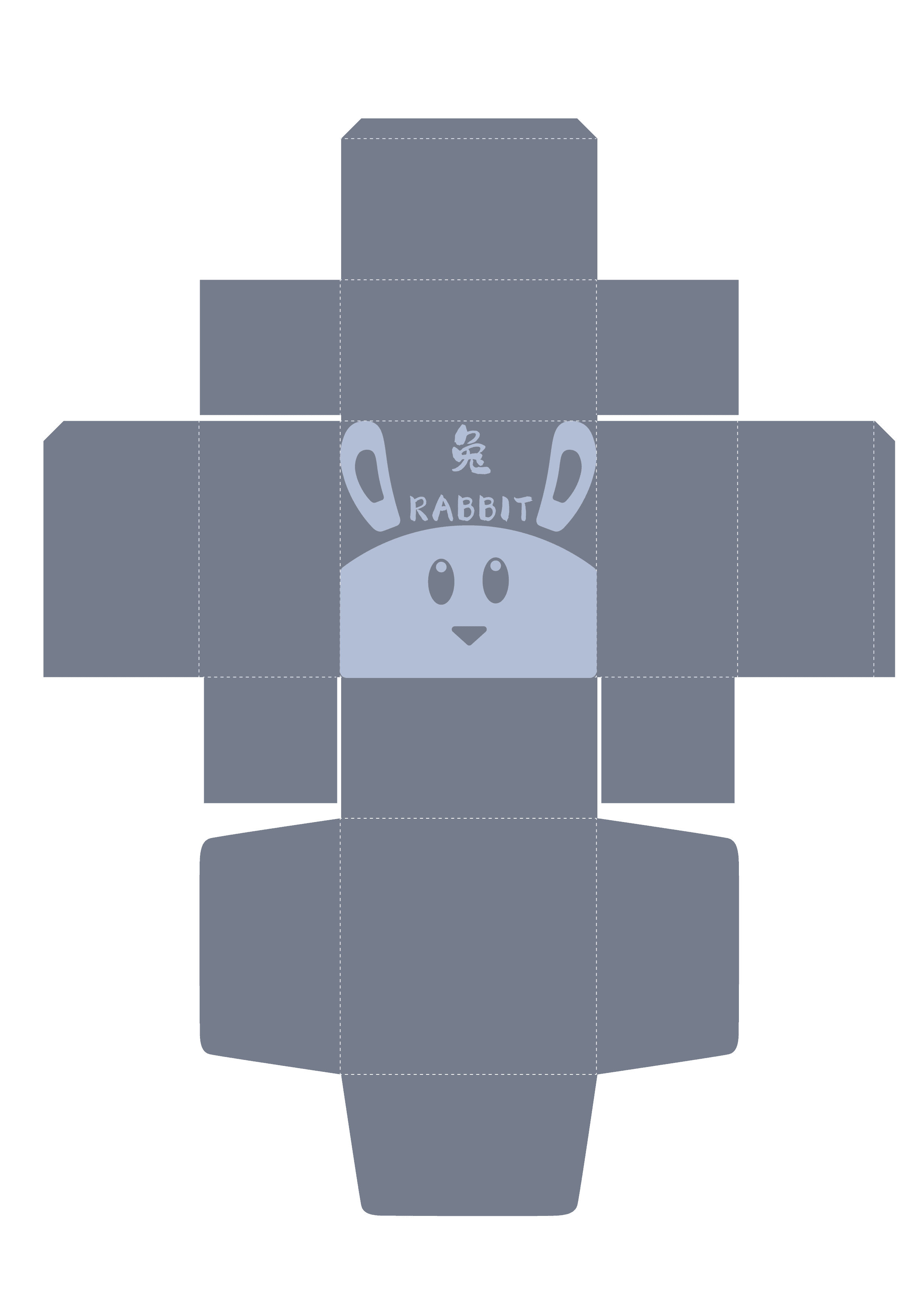
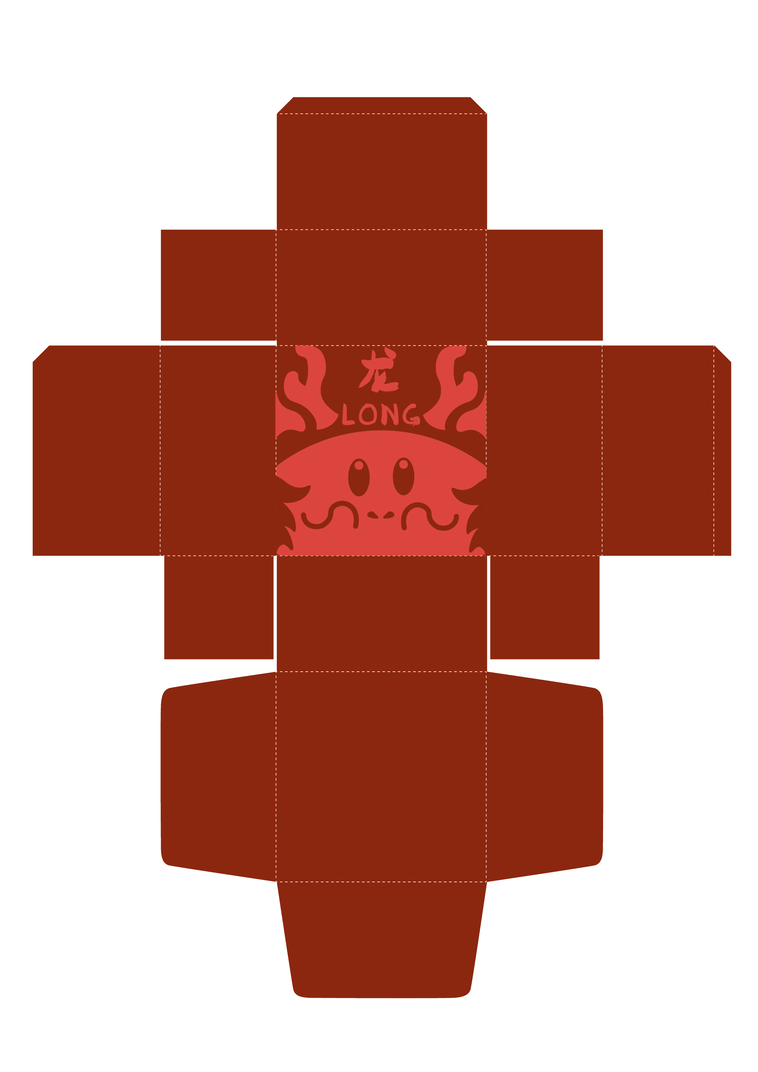
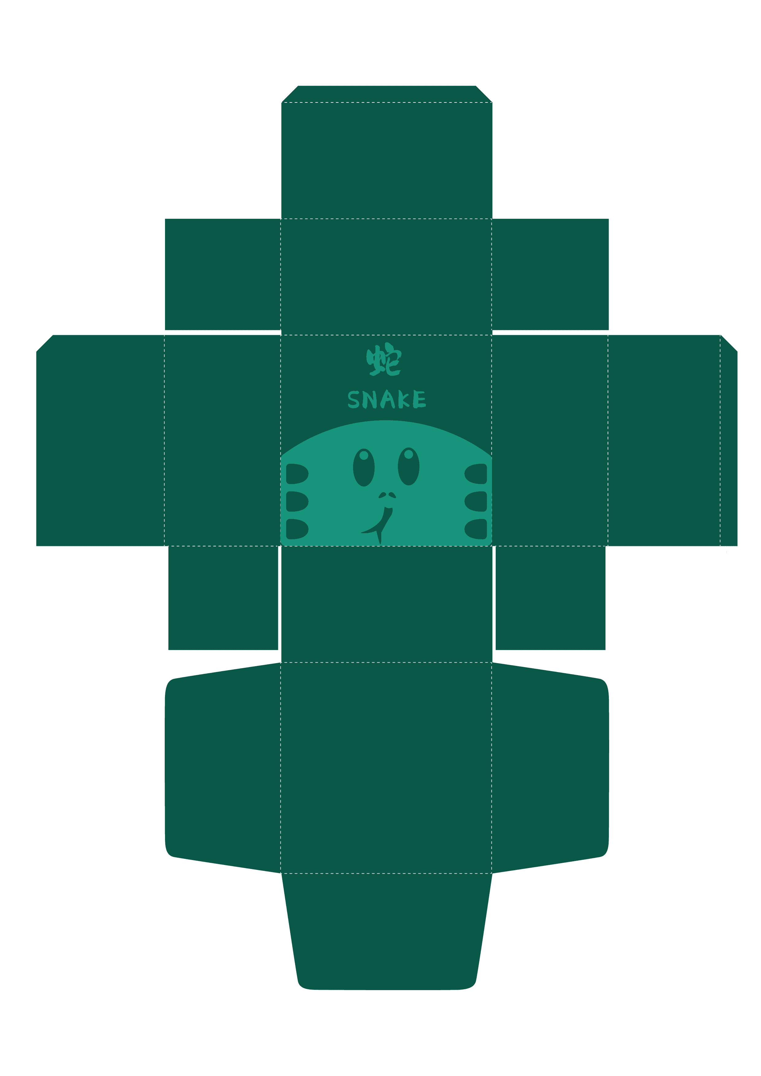
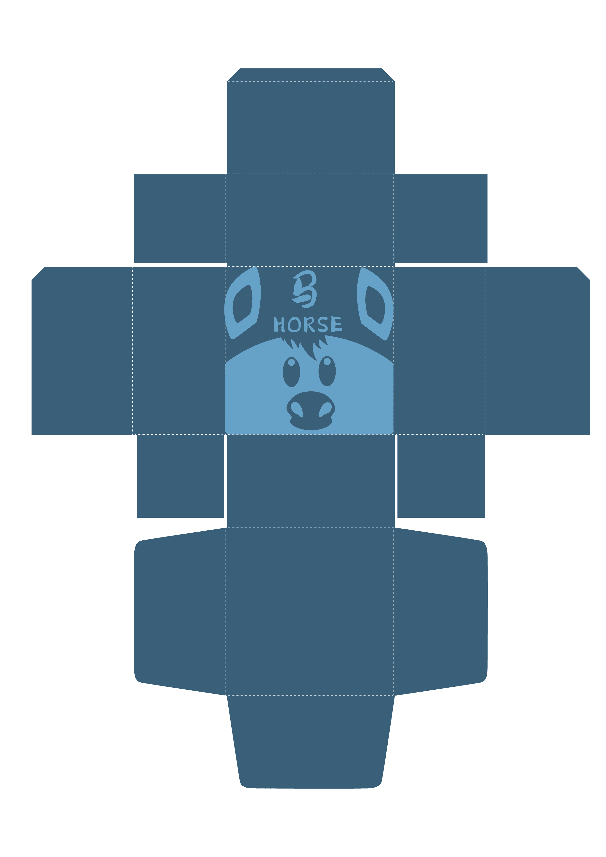

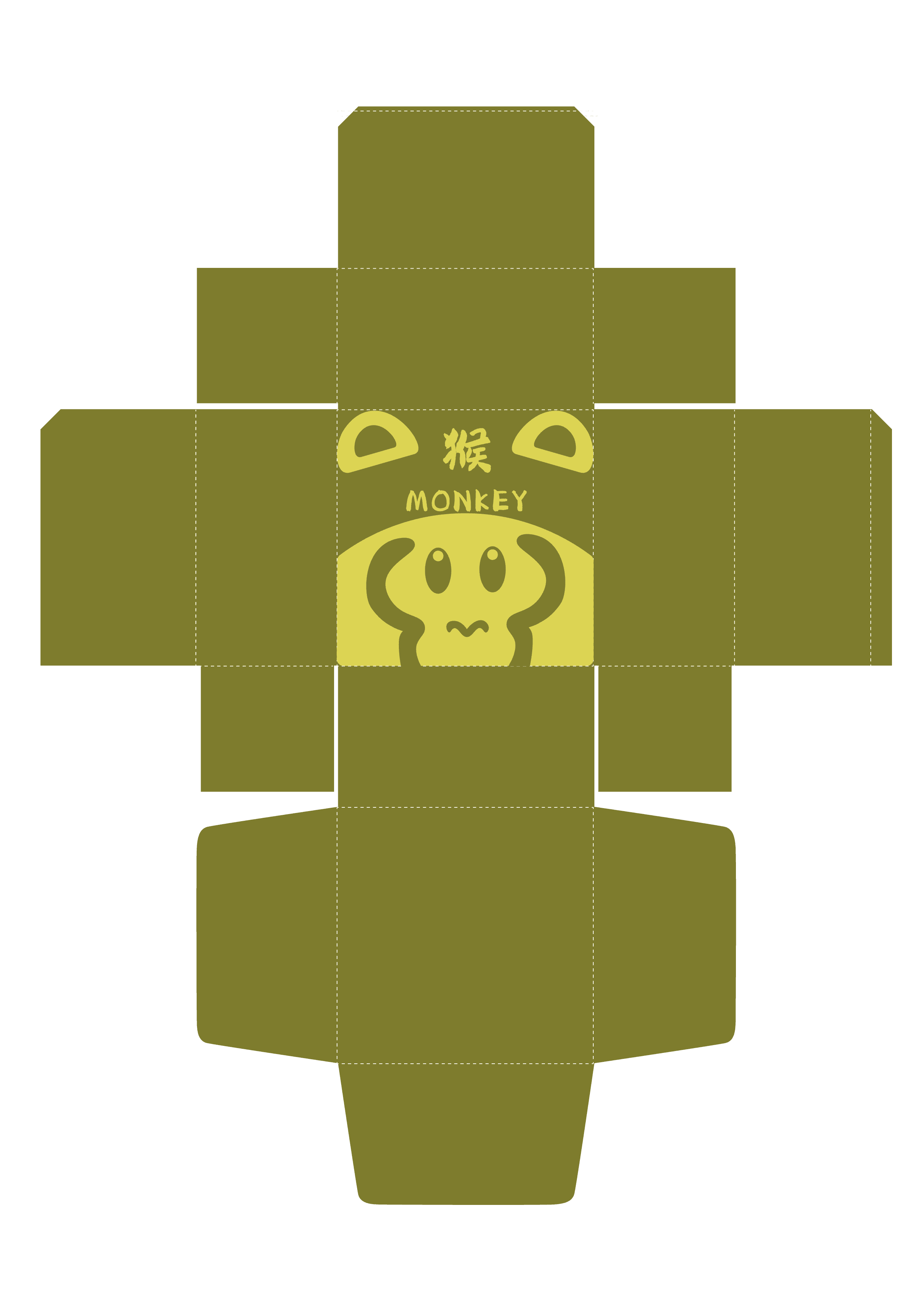
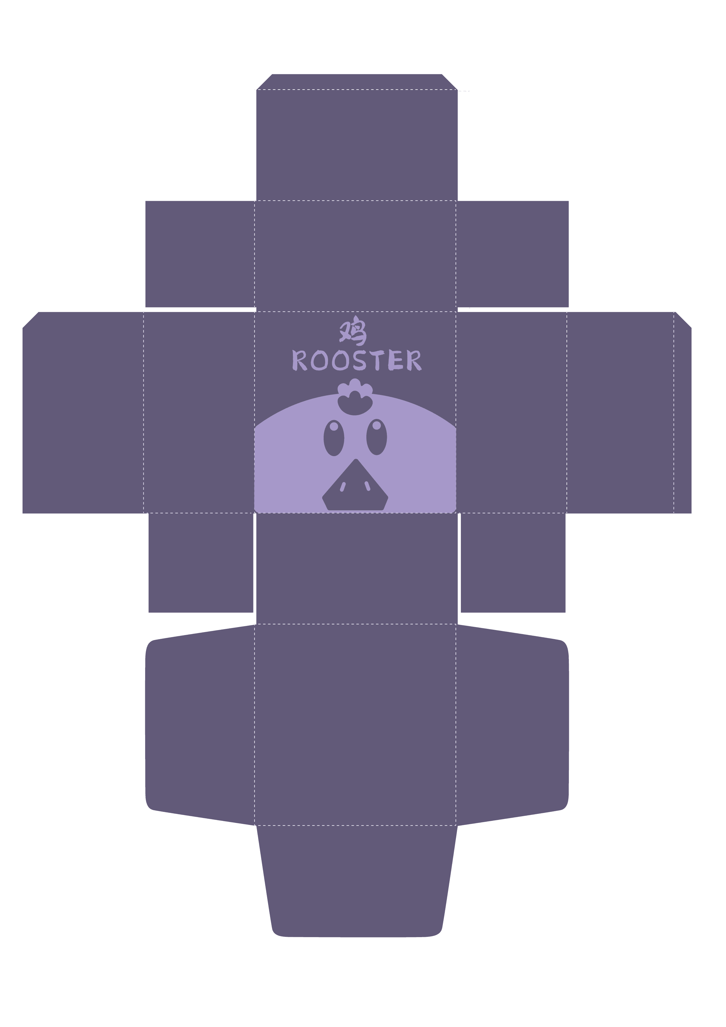
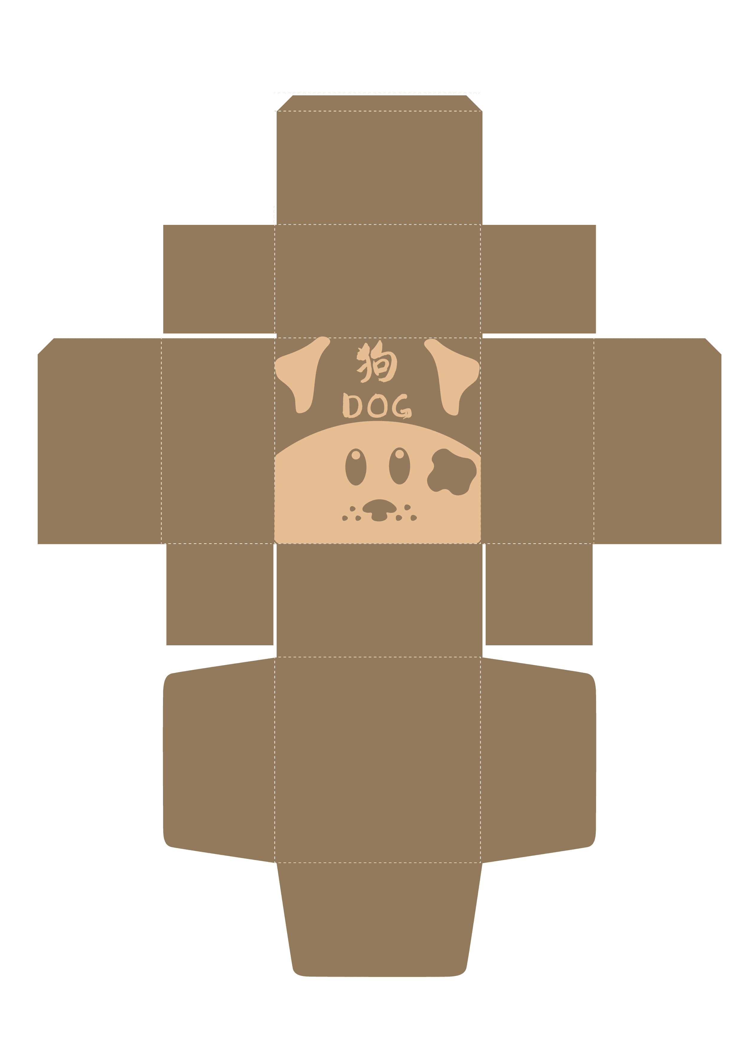
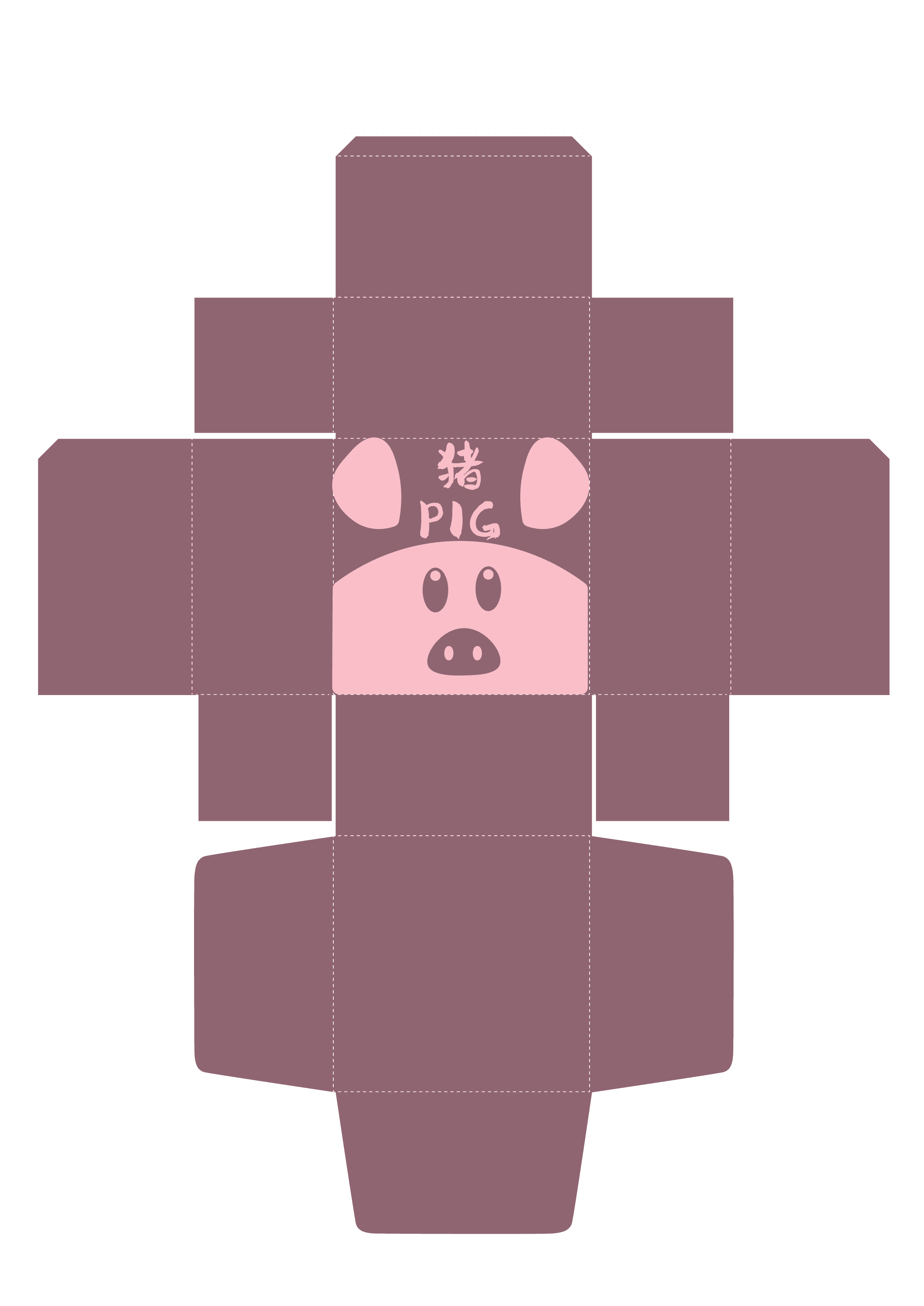
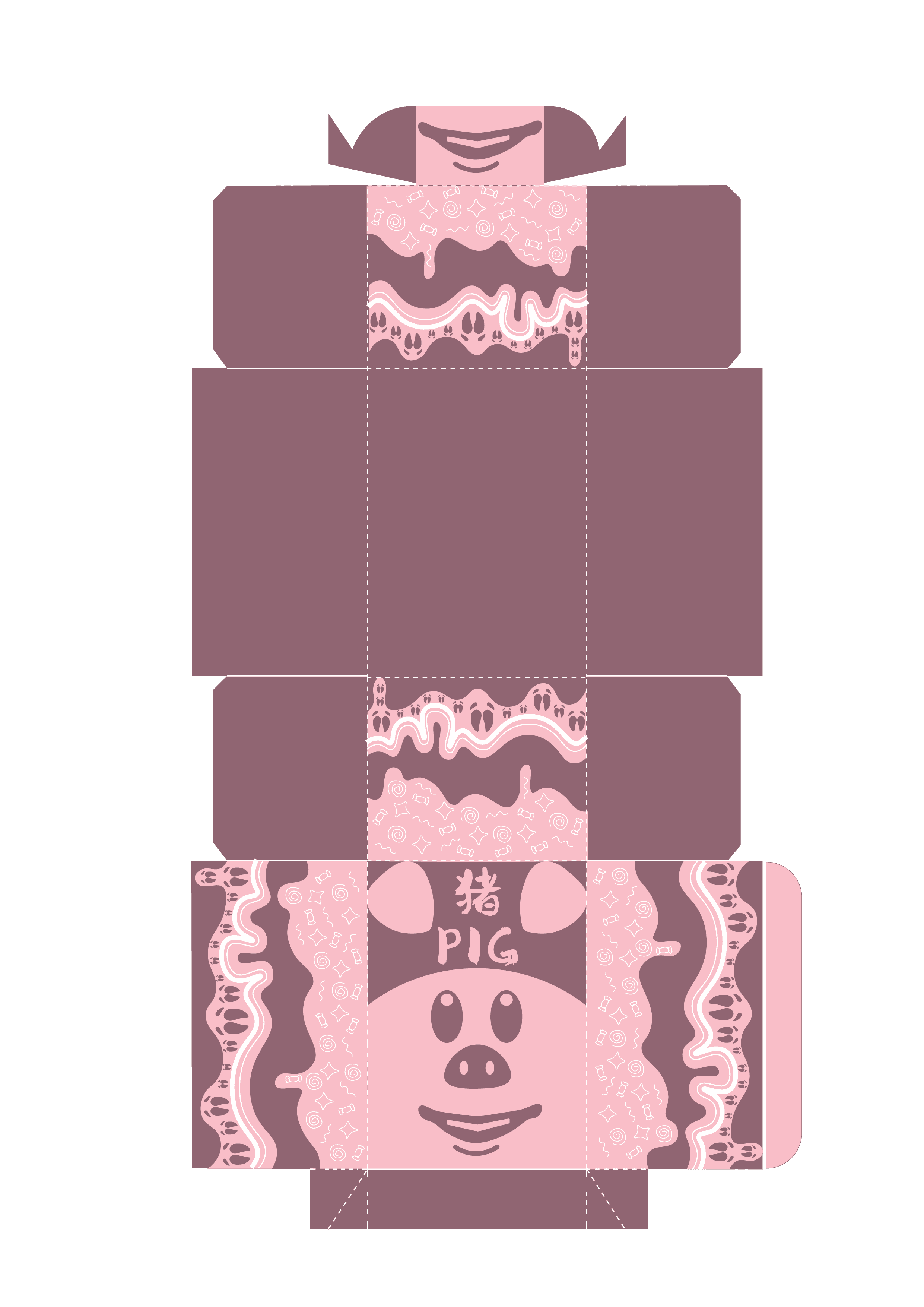
DIE CUT DESIGN - VERSION 2
The updated die-cut design incorporates a drawer function, adding a touch of sophistication and functionality to the packaging. This innovative approach enhances the unboxing experience, making it more interactive and enjoyable for consumers. The drawer mechanism not only provides easy access to the confectionery inside but also ensures better protection of the contents by minimizing exposure when closed. This design choice elevates the overall aesthetic appeal while maintaining practicality.