
PROCESS
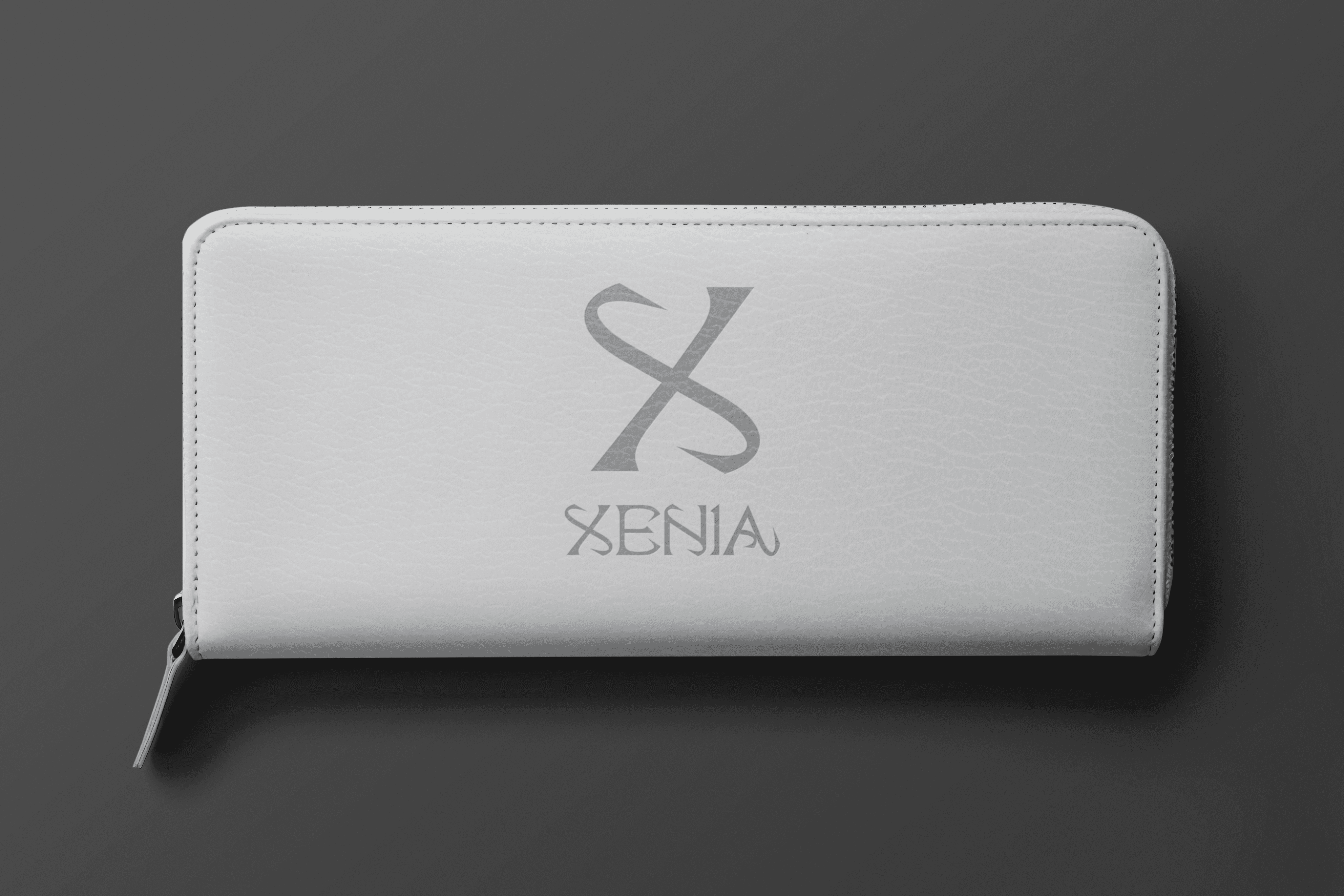
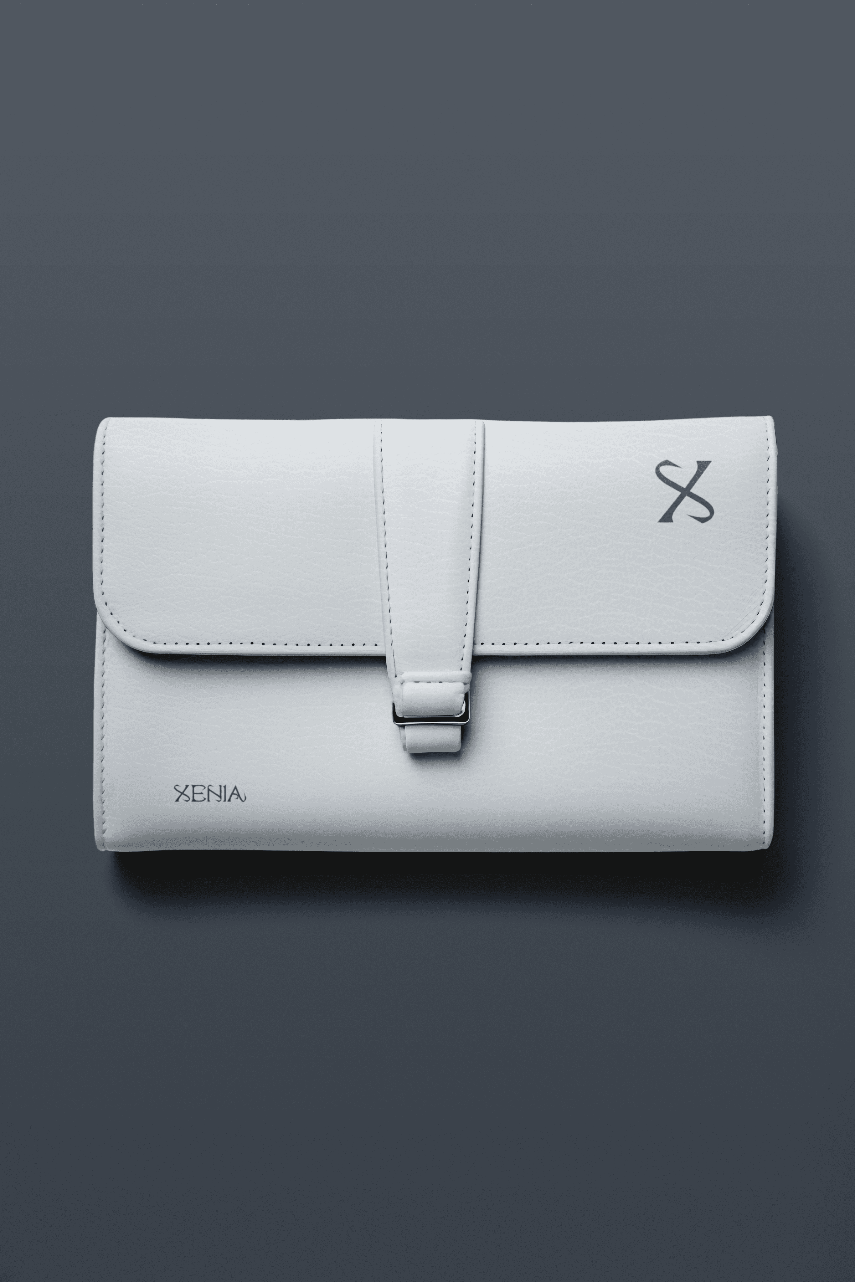
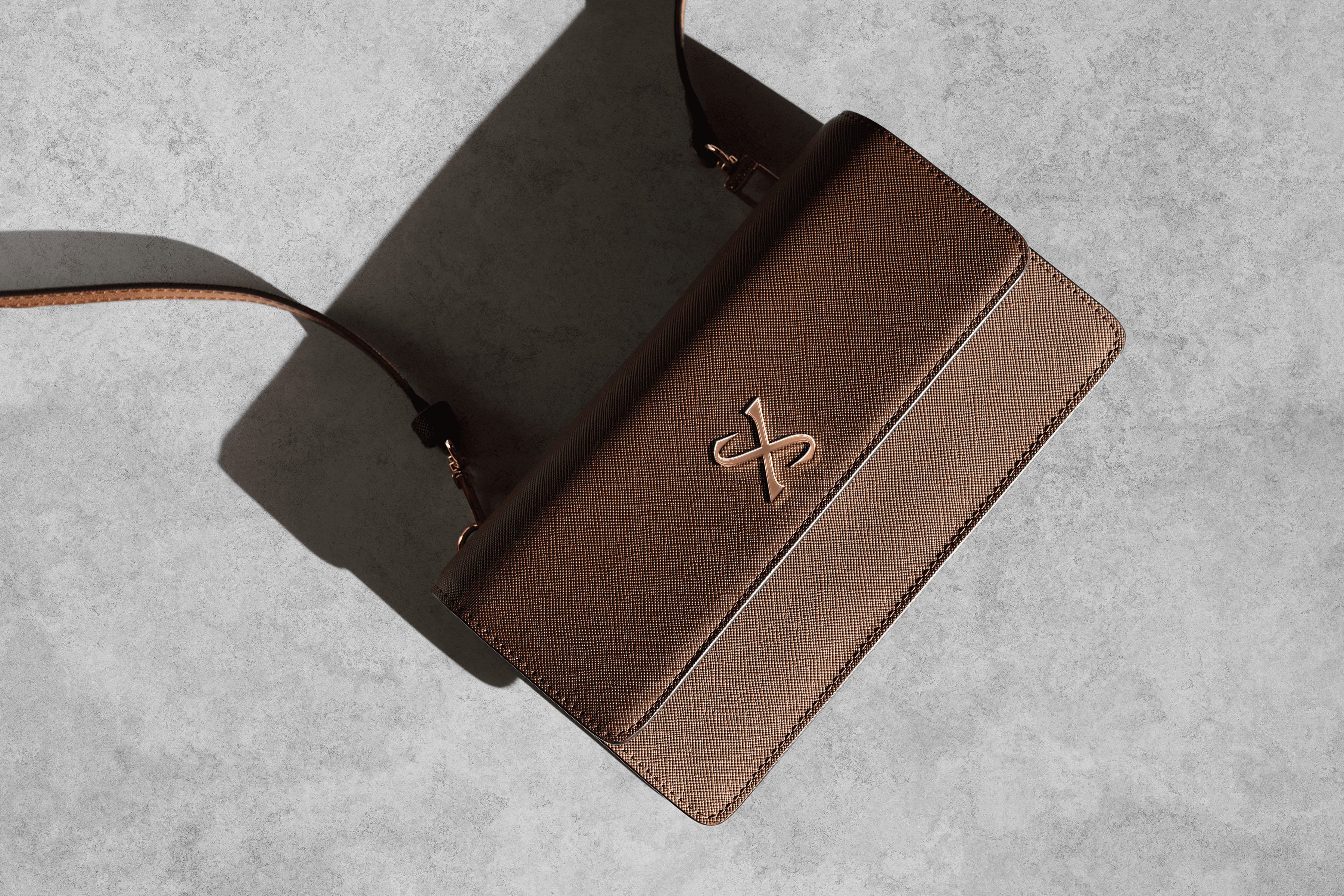
XENIA is a luxury bag brand inspired by the ancient Greek concept of xenia—the sacred tradition of hospitality, generosity, and respect between host and guest. More than just a name, XENIA embodies the grace of meaningful connection and the elegance of thoughtful design.To reflect this identity, the brand centers around a bold letter mark logo: a stylized “X” that captures both structure and sophistication.
XENIA: Carried With Grace
# FFD4EA
C (0) M (18) Y (7) K (0)
# FFD4EA
C (0) M (18) Y (7) K (0)
Deliverables
Logo Concept
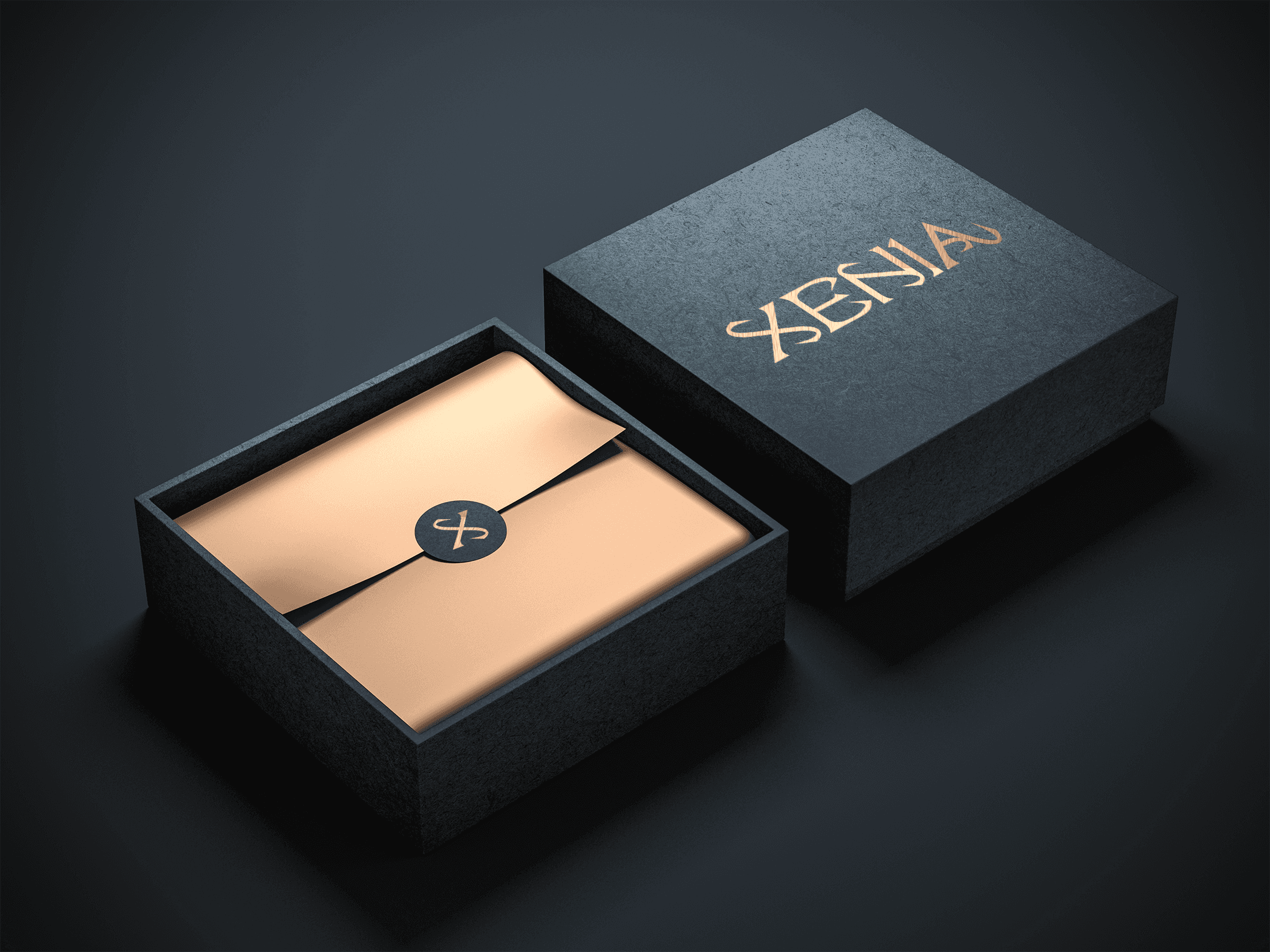
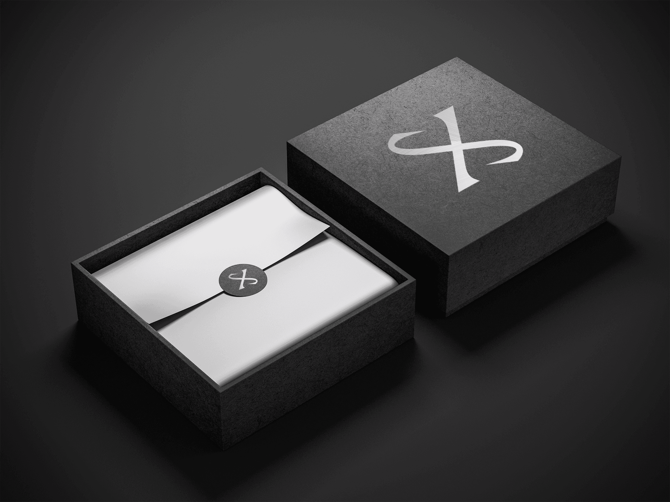
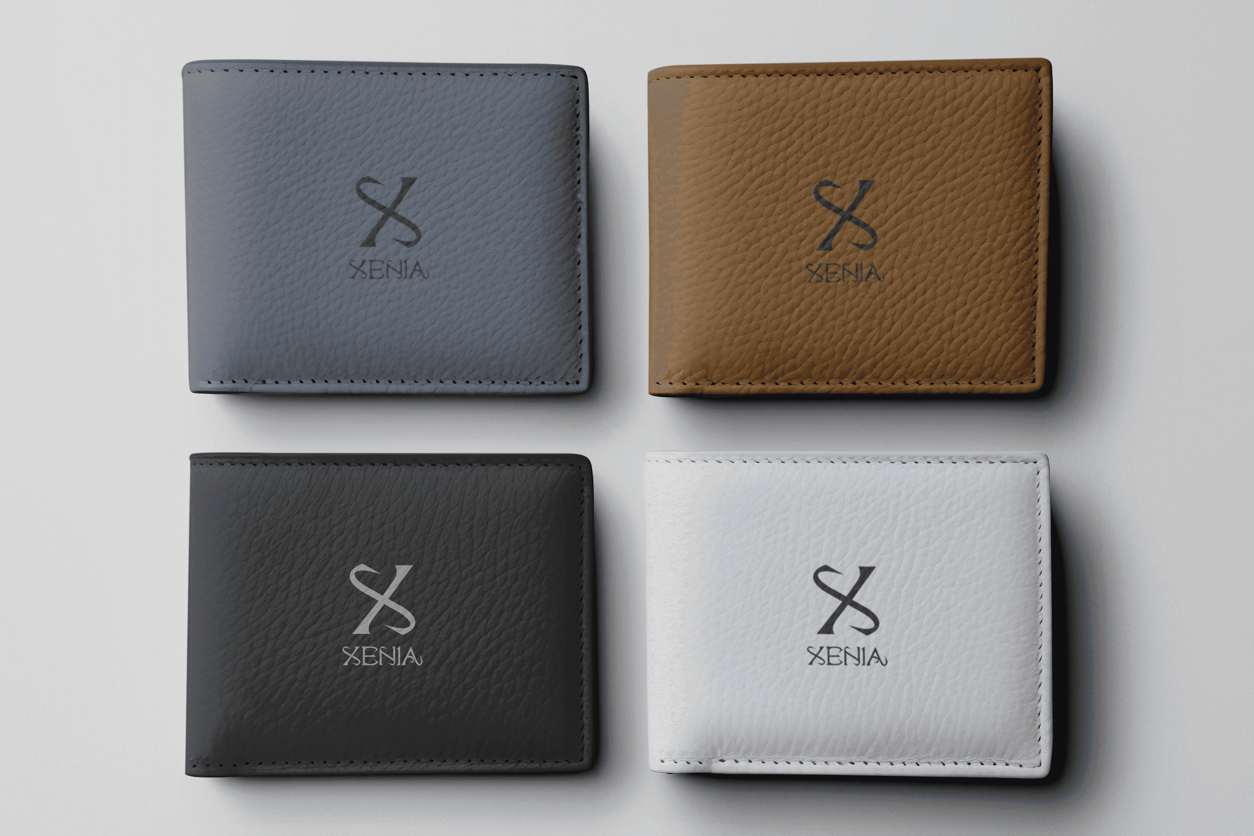
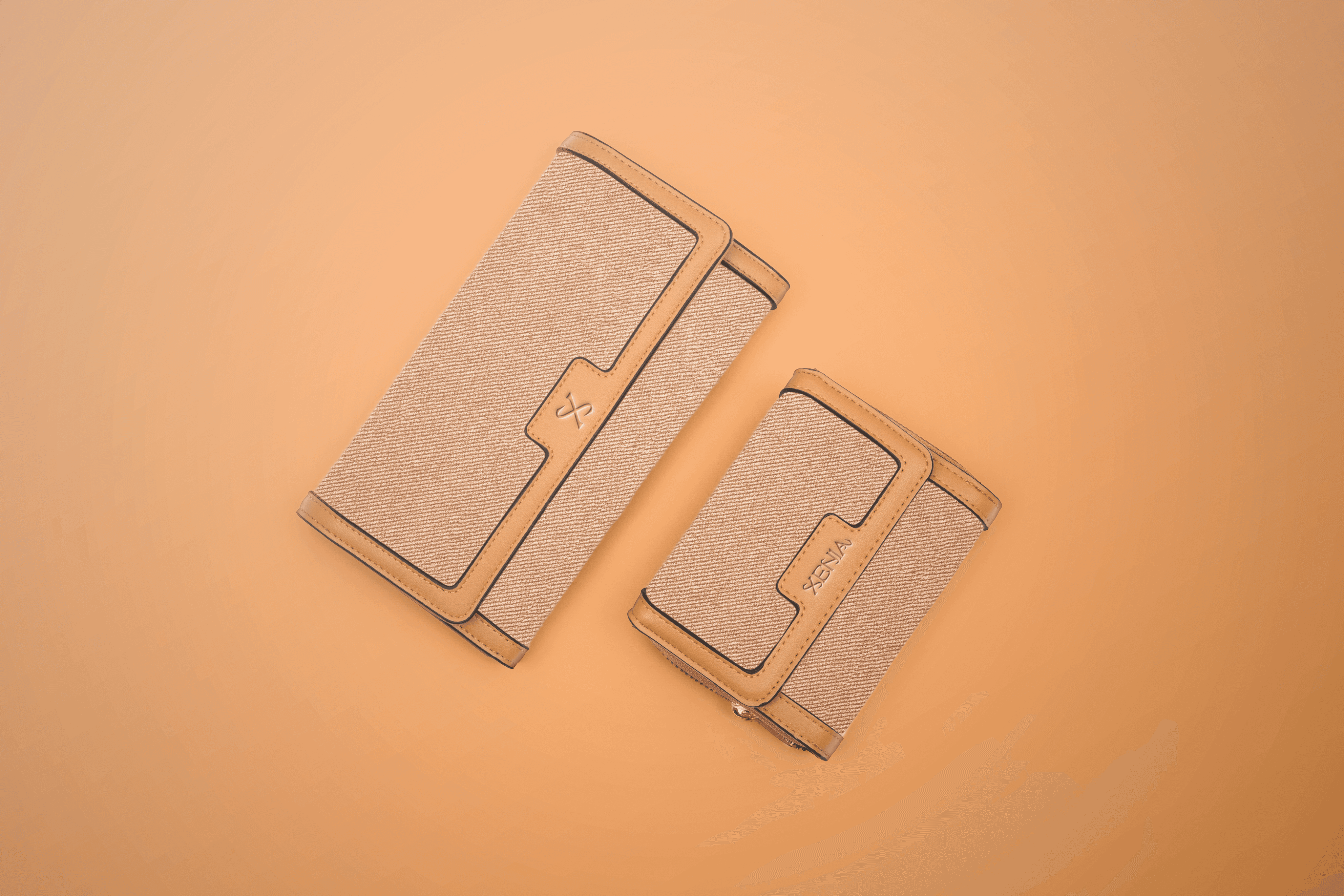
Packaging Display
Tools
Illustrator
Photoshop
About XENIA
Rooted in the spirit of timeless hospitality, XENIA redefines elegance through luxury bags that carry more than belongings—they carry presence. Each piece is a tribute to this timeless value, crafted to accompany its wearer with strength, poise, and presence. The brand’s identity is anchored in a stylized letter mark “X,” symbolizing both bold individuality and refined simplicity.
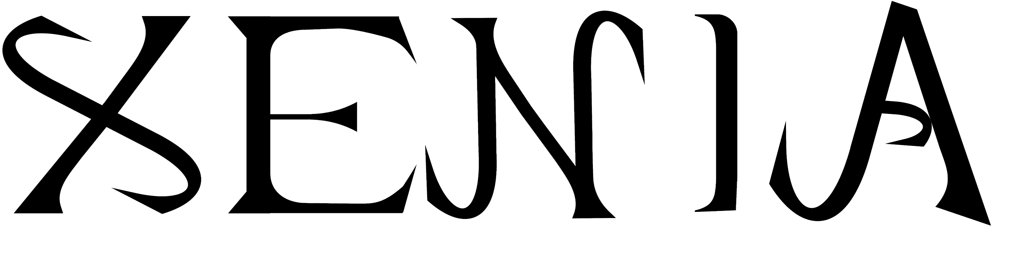
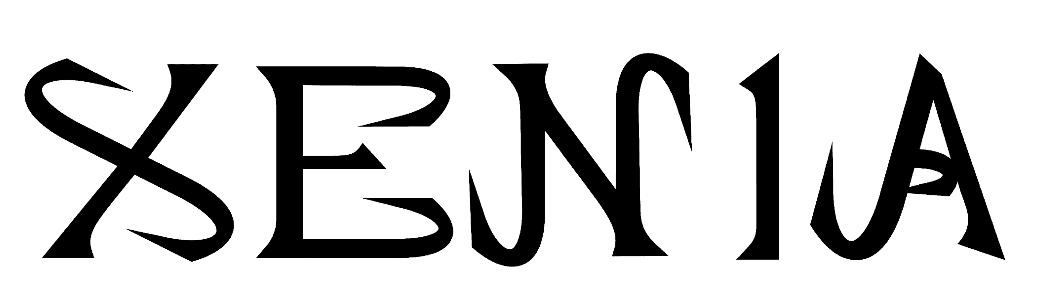
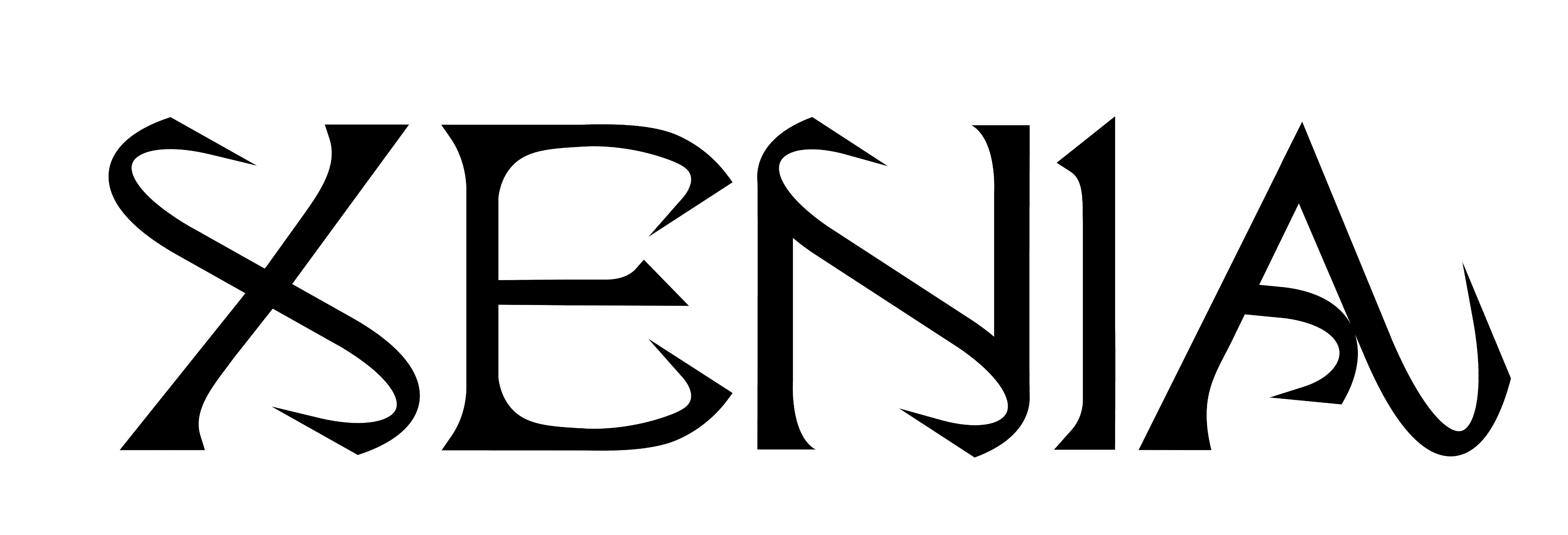
XENIA: Lettermark Ideation Process
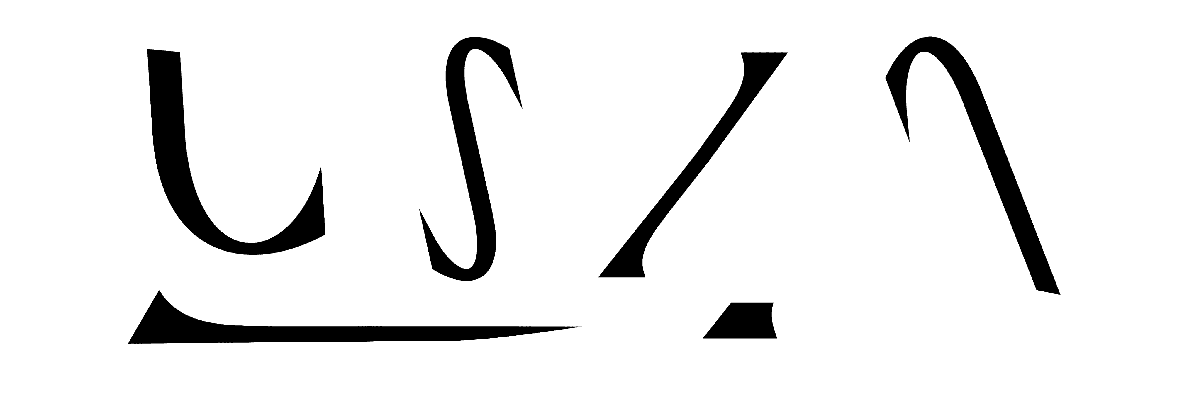
The creation of the XENIA lettermark began with an exploration of typographic abstraction. Using the four strokes that traditionally form the letter "X", I deconstructed and reimagined each segment to emphasize elegance, motion, and individuality. Instead of mirroring symmetry, I allowed each stroke to express its own unique curvature and cut, resulting in a composition that feels sculptural and high-fashion.
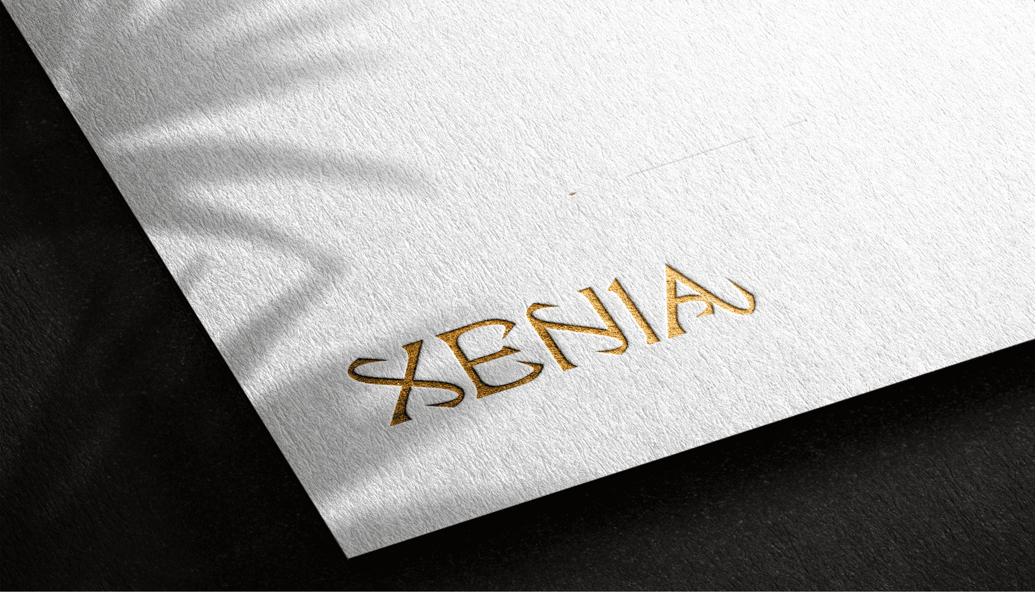
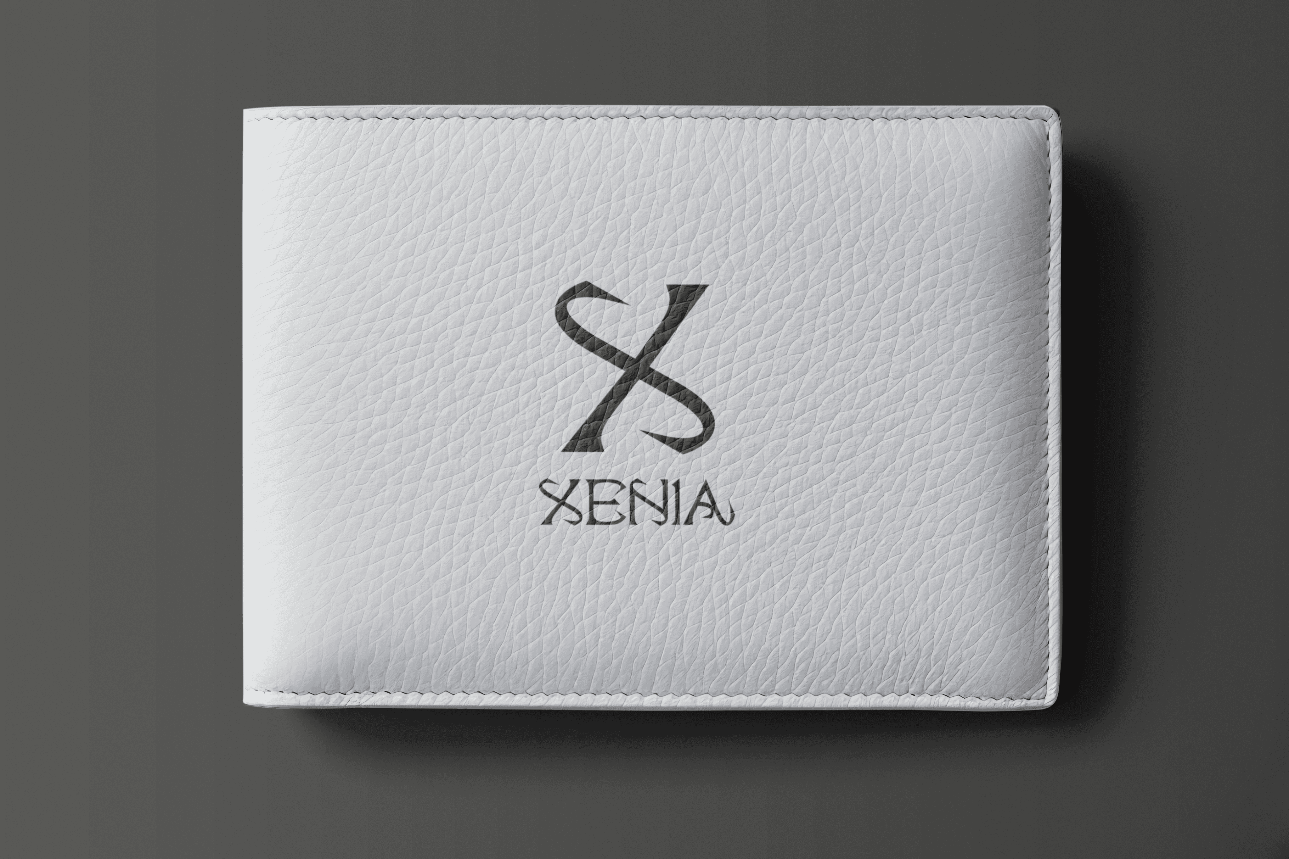
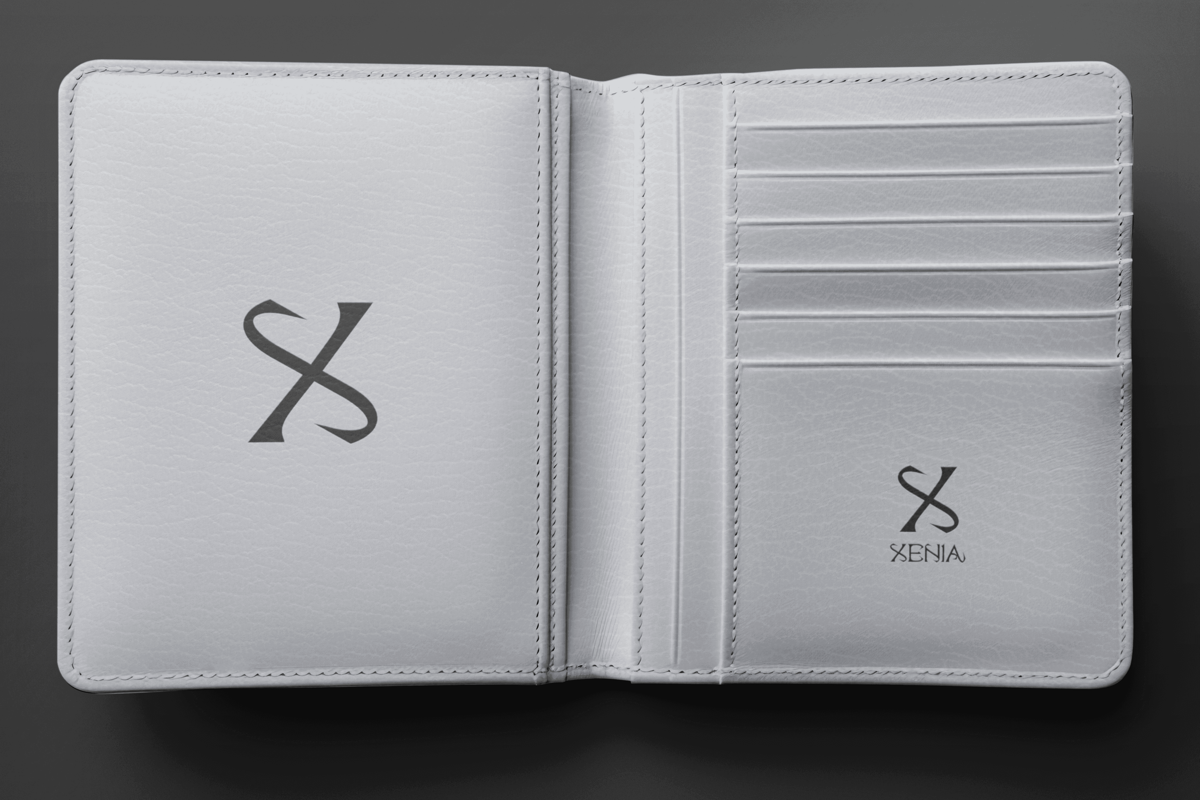
FINAL LETTERMARK DESIGN
Merge Letters: From Hybrid to Harmony
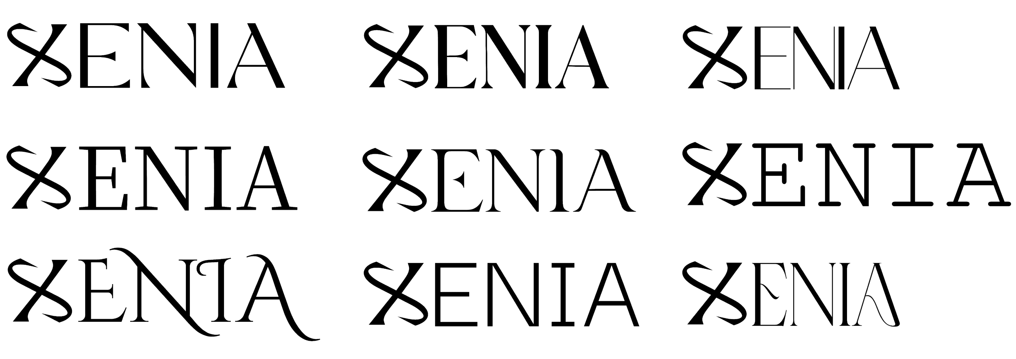
After finalizing the custom “X” mark for XENIA, the next step was to explore how it could live alongside type. I tested the form against various existing serif and display fonts—examining alignment, rhythm, and contrast between the stylized X and traditional letterforms. While some combinations offered visual intrigue, they often lacked the cohesion and nuanced elegance I envisioned for the brand.
IDEATION
IDEATION
Drawing from the DNA of the original “X,” I crafted a bespoke type system that mirrors its sculptural rhythm. The “E” and “A” feature bold terminals and distinctive cuts, while “N” and “I” embrace the verticality and curvature that echo the brand’s essence. The result is a cohesive logotype where every letter speaks the same visual dialect, forming a harmonious whole that reflects the strength, elegance, and modern heritage of the XENIA brand.
FINAL LETTERMARK DESIGN