PROCESS
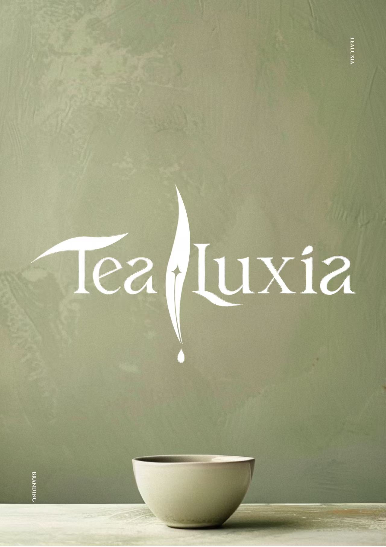
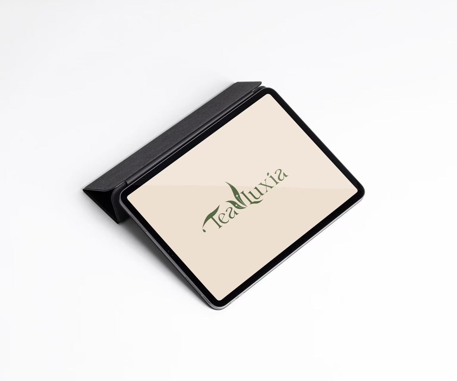
Creating a logo for Lǜchá (绿茶) that captures both the refined taste and quiet elegance of green tea. Through a blend of calligraphic strokes and organic form, this visual identity aims to evoke not just the flavor, but the serene experience of drinking Lǜchá — rooted in tradition, yet designed with a modern sensibility.
Lǜchá: A Visual Identity
Rooted in Tea Tradition

# FFD4EA
C (0) M (18) Y (7) K (0)
# FFD4EA
C (0) M (18) Y (7) K (0)
Deliverables
Logo Concept
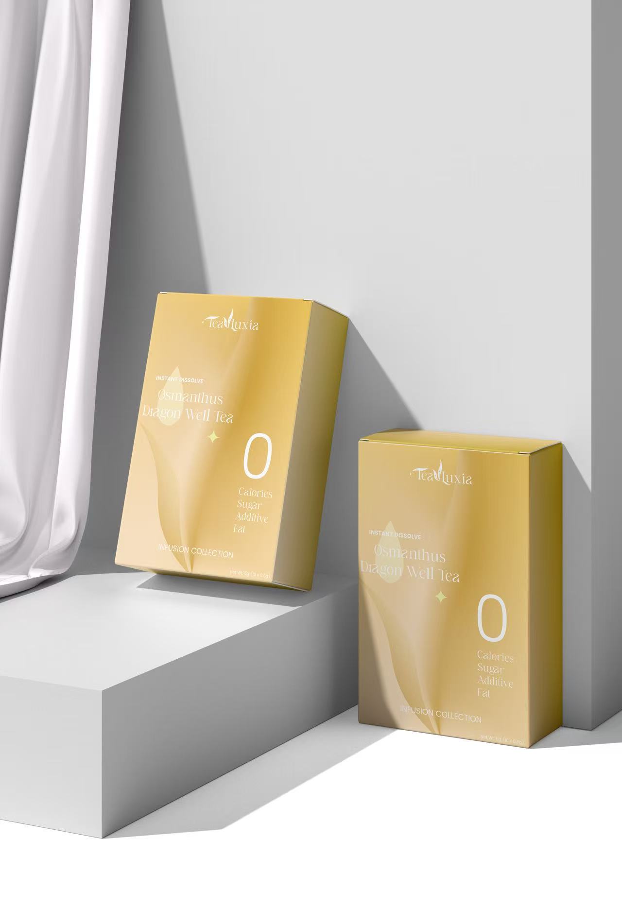
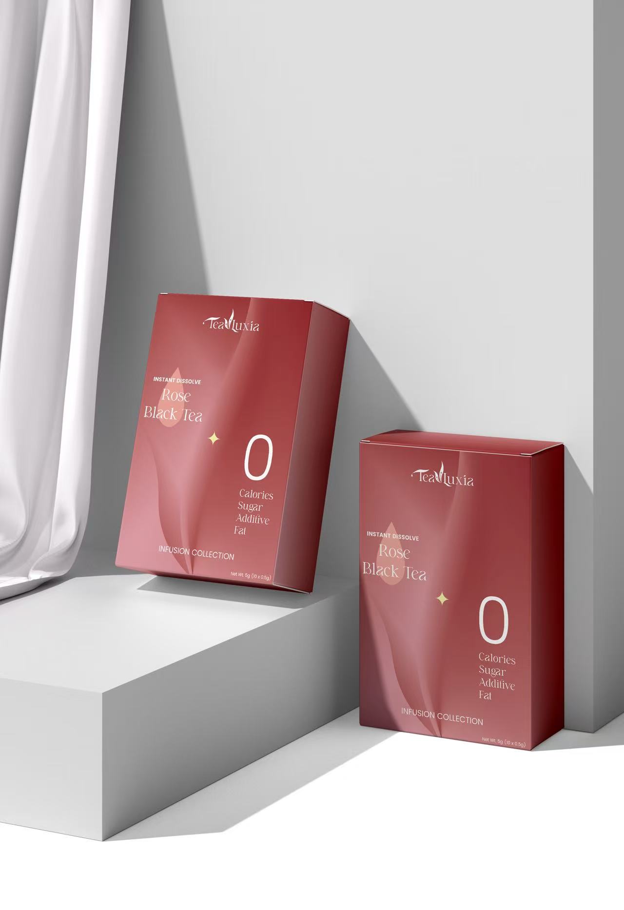
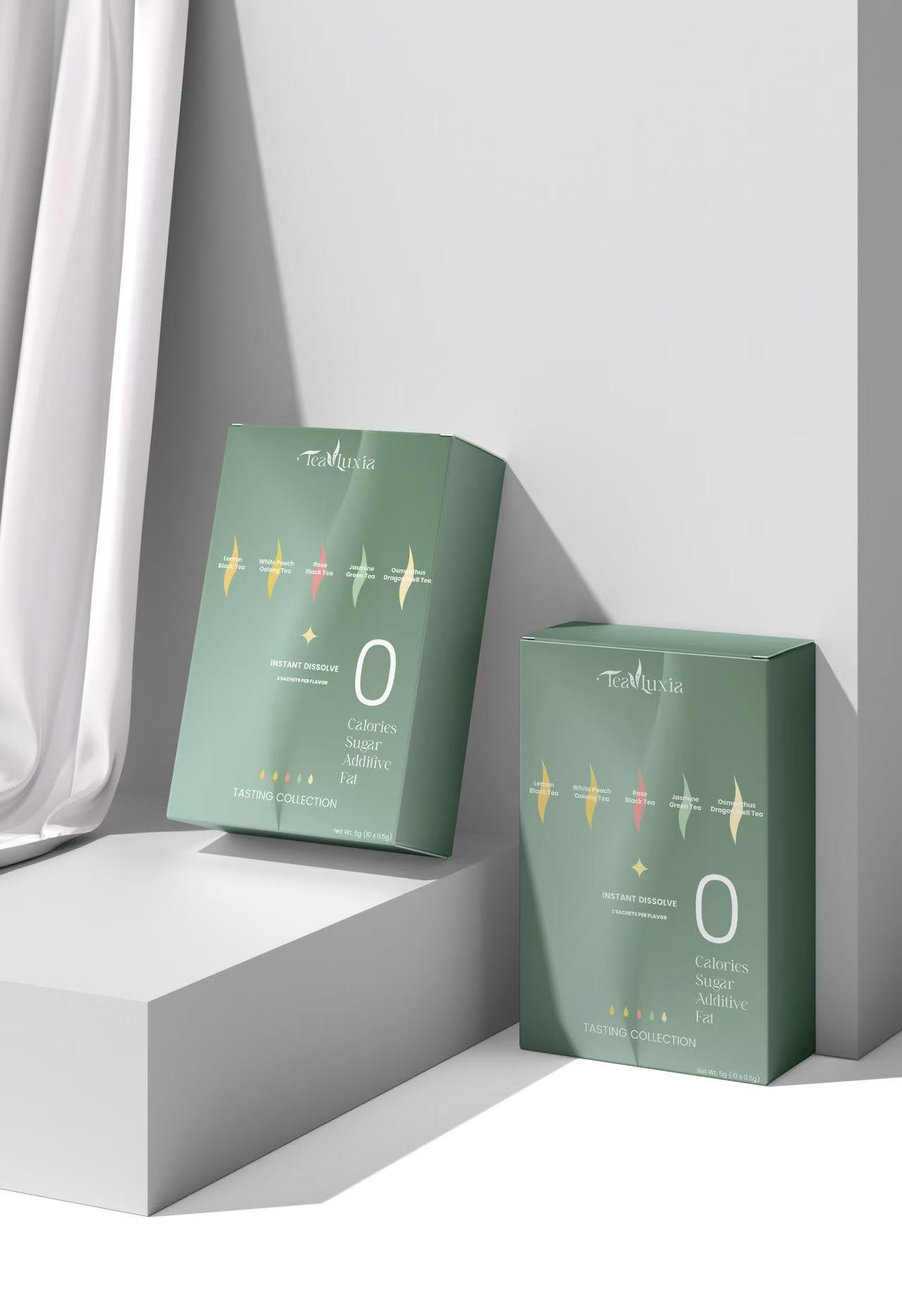
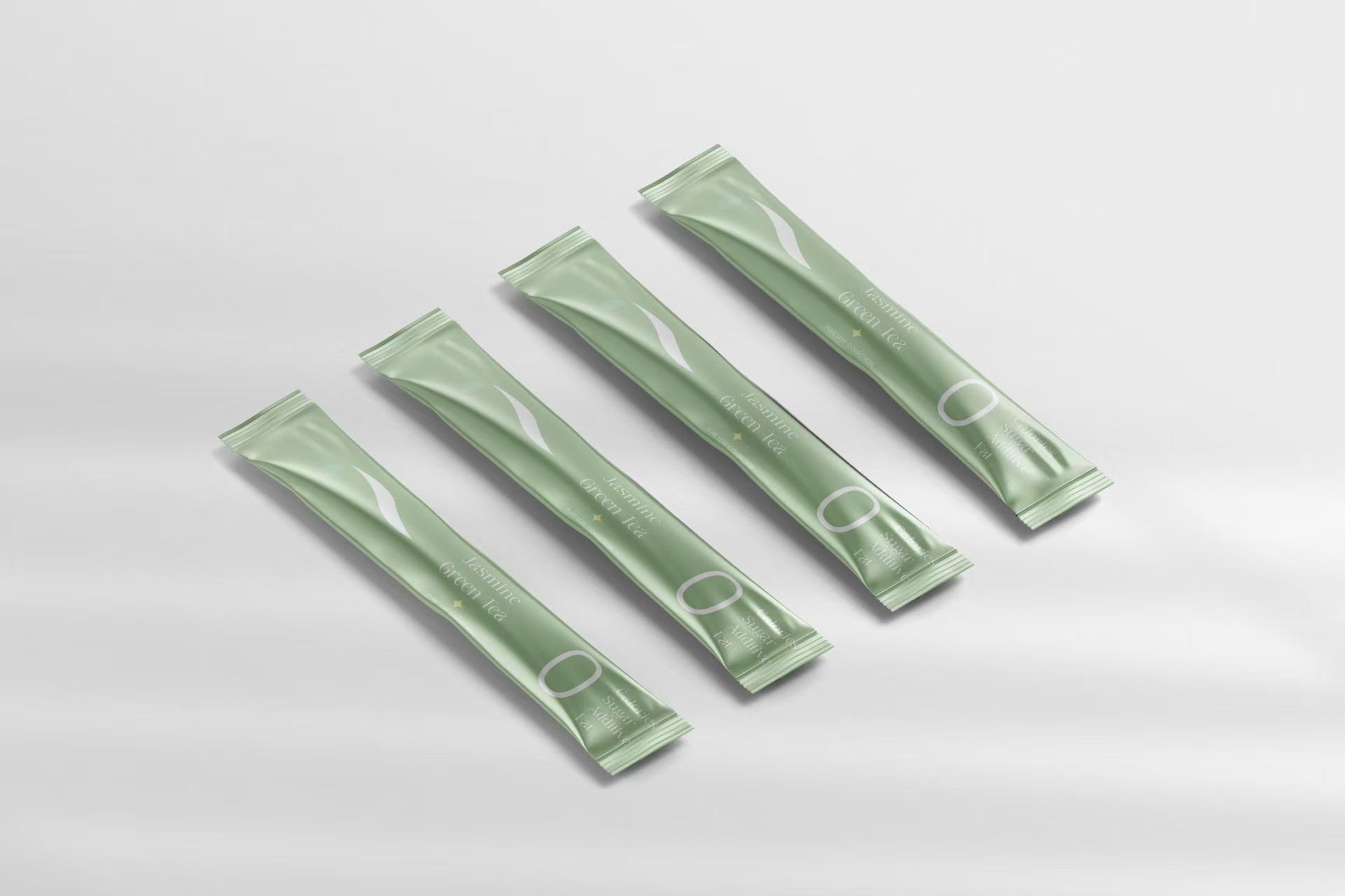
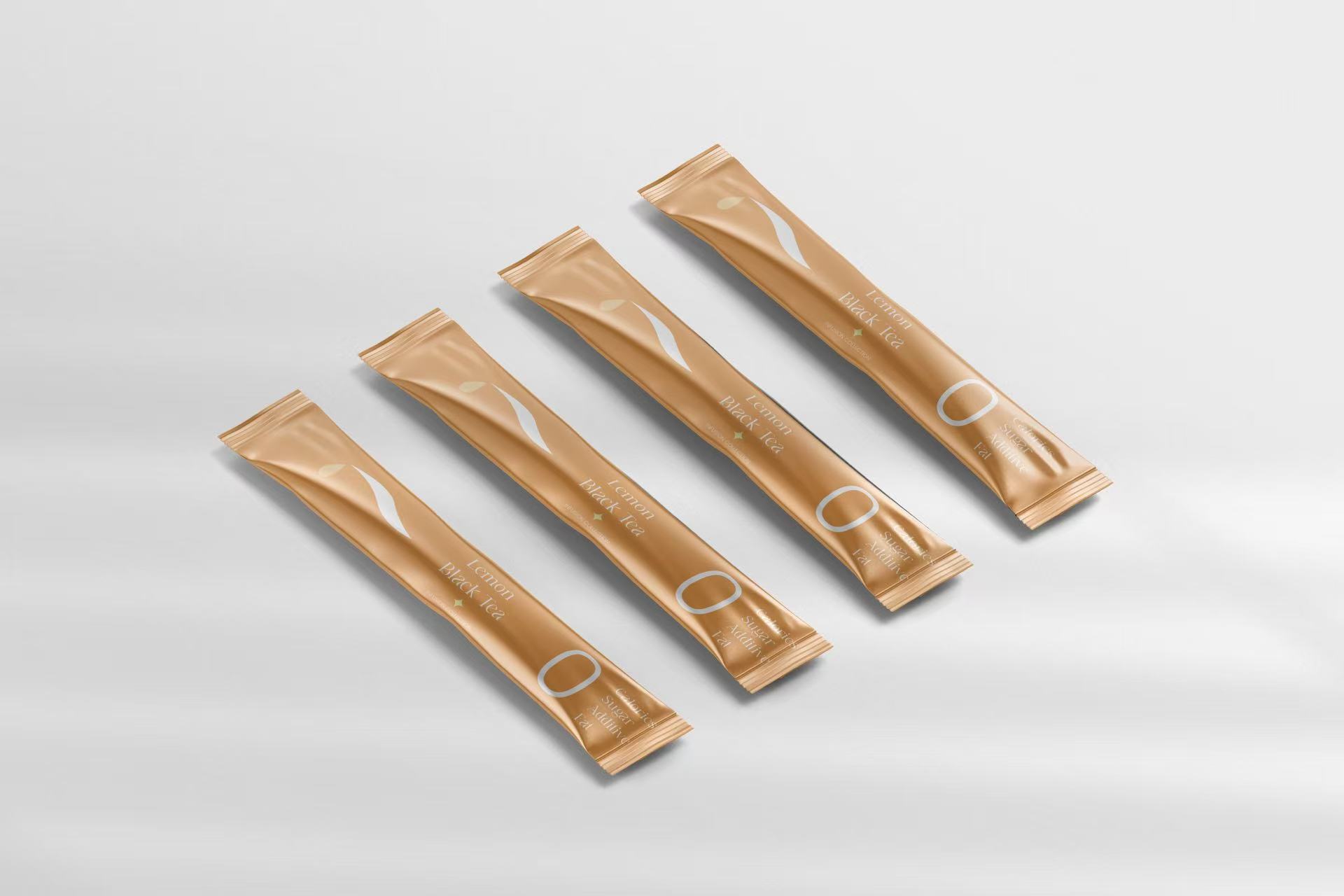
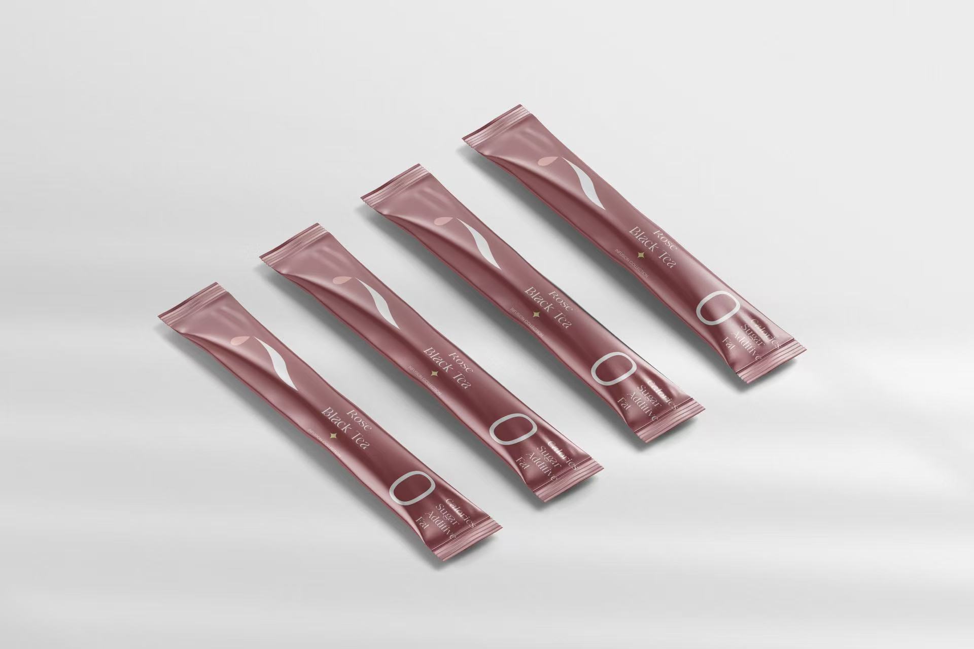
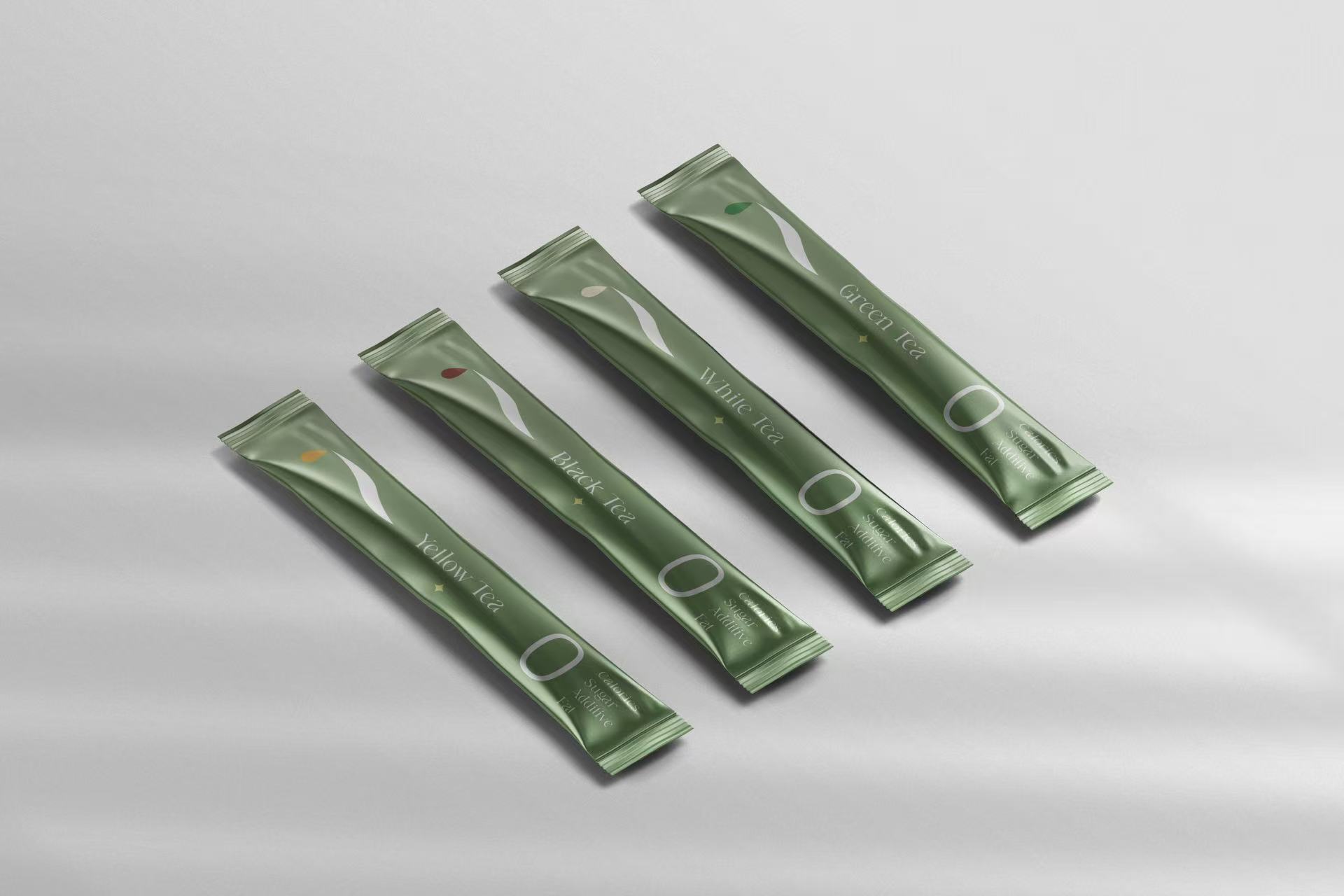
Packaging Display
Tools
Illustrator
Photoshop
About Lǜchá (绿茶)
Lǜchá, or green tea, is one of the most cherished teas in Chinese culture, known for its delicate aroma, refreshing taste, and healthful qualities. Unlike other teas, Lǜchá is minimally processed, allowing the natural essence of the tea leaves to shine through. It embodies balance, purity, and simplicity — values deeply rooted in traditional tea practices. This project draws inspiration from those qualities to create a brand identity that not only honors the heritage of Lǜchá but also communicates its elegant and refined character to a modern audience.
Logo Ideation
To express both the visual elegance and cultural depth of Lǜchá, I chose to design a combination mark — merging symbolic imagery with calligraphic typography. This approach allowed me to balance form and meaning: the pictorial element (inspired by a tea leaf and flowing liquid) evokes nature and purity, while the hand-drawn Chinese characters ground the brand in cultural authenticity. A combination mark was the best choice because it offers flexibility across applications — the icon and text can work together or stand alone — while creating a memorable and meaningful identity that reflects the refined experience of drinking green tea.
From Stroke to Symbol: Crafting Meaning Through Form
This logo began with a simple intention: to capture the essence of Lǜchá not just through imagery, but through feeling. I started with hand-drawn strokes inspired by the flow of steam, the organic curves of tea leaves, and the tranquil rhythm of tea pouring.


FINAL DESIGN OF THE SYMBOL
IDEATION


TYPEFACE: 默陌追风手写体 Regular
# FFD4EA
C (0) M (18) Y (7) K (0)

Merging Language with Form
Integrating the Chinese characters for “绿茶” (Lǜchá) into the visual composition, merging them with the flowing strokes developed earlier. This decision marked a turning point — not just visually, but conceptually — as it allowed the logo to speak in both imagery and language.


IDEATION

FINAL DESIGN OF THE SYMBOL